
As I’m writing this post a lot is happening in the digital realm of tech companies after a constant growth for ten solid years. Recent news have told us major lay-offs have been happening:
- Meta 11,000
- Amazon 10,000
- Twitter 3,700
- Stripe 1,000
- Redfin 862
- Lyft 700
- Opendoor 550
- Jull 400
- Zendesk 350
- Chime 160
- Salesforce 110
- Paypal 59
The tech industry is contracting over years of expansion because of several factors that were acknowledged and ignored. But I’ll write about this on another dedicated post.
Large companies aren’t exempt from losses and failures and often it’s about small details where this happens, much like you would trip and fall over a small pebble stuck in the ground which might as well be the tip of the iceberg leading to many other issues.
What is the value of a product when a brand purposely leaves behind the UX portion of the project? Imagine running a restaurant and inventing a new dish to serve to thousands of customers, now imagine opening the pantry and add ingredients based on your personal liking and nothing else, forget proportions and quantity-measuring. What do you think it might happen? Awful taste, allergy risks, unbalanced seasoning, just to mention a few scenarios or all together happening at the same time. There’s your answer, now make it look pretty and ask people to eat it.
Despite sounding awful, I’m constantly finding out poor product development because of the lack of User Experience. Why this? The quickest answer: UX is ignored because companies believe it’s an aesthetic process of product development, they read ‘design’ and think it’s a superfluous step. Don’t be surprised if you see software companies unaware of the UX design process, they will most likely answer:”We already have our graphic designer doing the interfaces”.
Graphic designers are capable professionals to deliver digital goods for your products, however, they are often lead by company figures that have different skills and have been working on front-end developing, or back-end developers building interfaces without having any user’s input on testing it. This has convinced me there’s a lack of knowledge in UX from those companies that are creating products and services.
I’ve seen big Silicon Valley works delivering poor UX despite hefty budgets, interfaces developed by software engineers that are impossible to use, applications that only work in the mind of the person that created them. All these products that have failed suffered from poor or total absence of UX.

I’ve seen plenty of products that disappoint from the get-go because there’s no connection with the user. Engineers can craft the best goods but at the same time will risk to bankrupt their company, all this because the usability is poorly made/implemented and there’s no advantage for customers. Companies ought to explain their products’ functionality the easy way, so easy you can explain it to your grandma.
Consumer products can be highly reliable until their functionality is compromised by poor or the total lack of UX in their development cycle. If you’re making goods for the average buyer, why are you complicating the usability experience? The eternal enigma that has been with us since the dawn of sales.
My mother raised the million-dollar question each time we got a new dishwasher:“Why aren’t women developing these products?”. She’s been right this whole time because she knew women would interact with more frequency with a dishwasher in the kitchen than men. Thus we would have a product developed by men without experience over dishware and food preparation, where the racks and trays to place forks, knives, plates, would often be designed without practicality with bad space allocation making the washes and cleaning difficult.
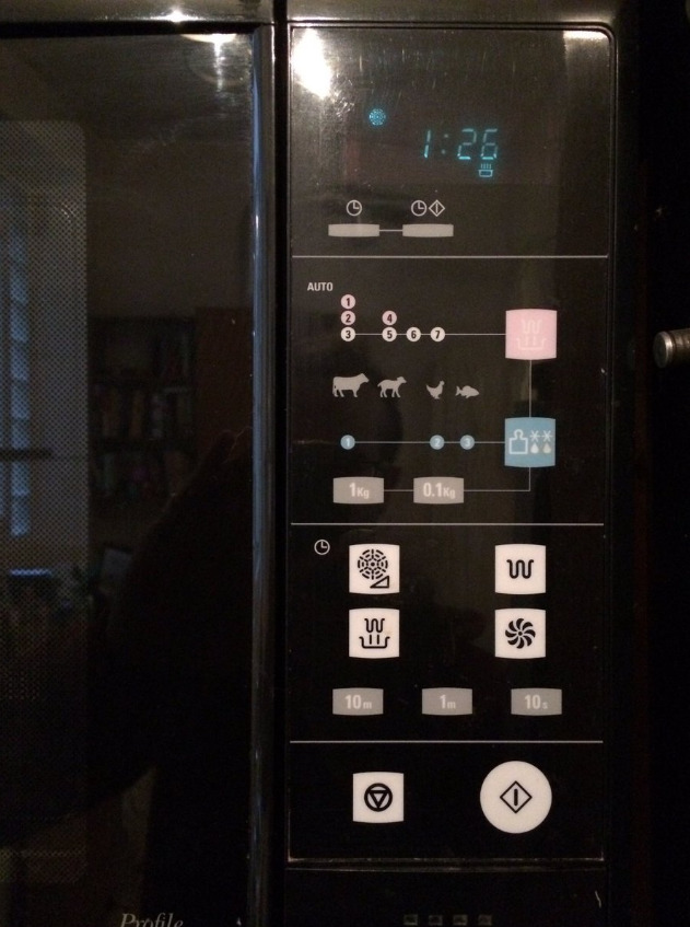
The other products that suffer from poor UX are microwave ovens, here above the strange interface that probably made sense for the engineer that soldered the circuits behind, but it’s useless to your target audience. If your grandma cannot use it, then how do you expect to sell it to others? I’m using ‘grandma’ as an example of user that is most likely to interact with food-making products, I watched my grandma over the years using analog and then digital goods mostly in the kitchen because that was her realm; she raised three kids by herself making sure they were fed as it was her top priority, also she would prepare my favorite dishes like no other because grandma have a the deepest knowledge in selecting the best ingredients.
However, household items aren’t the only ones suffering from bad UX, automotive designers tend to complicate things when creating a product for drivers, especially when it’s about those tools that provide information or respond to inputs like the center console of the dashboard. My personal experience went from driving my first car without power-steering and with few buttons to press, all the way to digital screens to touch for radio and navigation interfaces.

A good friend of mine had an Opel Astra with the above pictured dashboard, a very sturdy and reliable car very comfortable both for city and highway use; it had one flaw where understanding how to change radio station, temperature, air flow, was a total letdown because of an over complicated interface of the command console. It was very complicated because it was designed without any UX principle, the first one being to make it easy for the user to interact with a product.
While driving you want the least distractions and this dashboard wasn’t helping, often my friend had to stop the car to interact with the console, not even him could understand how to properly use those buttons and became a distraction to use this tool. The first thing that throws you off from this console is the lack of distinctions from the buttons, they tend to look all alike from one another, so you might confuse the A/C from the radio station presets. This experience would break the Law Of Proximity and the Law Of Similarity.
User Experience and User Interface are complementary because their goal is to provide the user a clear and successful product/service. They can be separated and lead by two different designers, but they are essential to great products and to brands’ happiness; without them your company is investing on marketing strategies to sell what you’re producing trying to cover the fallacies during the development.
Allow me this hyperbole: Apple’s product sell themselves. Everyone on this planet recognizes an iPhone, a MacBook, an iMac, yet there’s no advertising on TV, newspaper, magazines, about their creations. Apple made its priority to invest a lot in the UX/UI process because the company knew how important for their brand was; an expensive product must have an expensive design department.
Because of this I’m convinced great ideas can be successful when they are backed by a solid UX, minimizing the need for marketing investments to justify the presence and sale of a product with ad campaigns. I’m also convinced that popularity through marketing is a big coat of white paint to embellish a façade with many cracks; several recognizable brands place massive advertising budgets to sell average products on the market. They do that because their priority is not quality but quantity as their established business model, so they would often create a narrative about the history and care of their product and pivot on that to sell it (think about that brown whiskey from Tennessee).
But why UX? This discipline places the user at the center of the experience balancing several important aspects, and this means we are creating something for a person to use in order to fulfill the need to buy the very same product. Companies that avoid or forget to consider the user as the main protagonist of their works will have on their hands a faulty product. This translates into resources invested the wrong way, and you probably are using a product/service that wasn’t thought for a person to be used, but rather it was developed for another purpose and you are using it without will or passion.
Think about a diet for weight loss and how they create great discomfort to people, yet are a necessary tool to improve our health. Doctors focus a lot of their work process onto the therapy removing the patient (the user) outside of the system, so when they draft a diet that doesn’t work so well it’s because they ignored the needs of the user. You can cut calories through a deficit and lose weight, but what food are you eating? Is it the right food for your body? Is it the right food for your work schedule? I didn’t know that by switching to a protein-based diet with minimal carbohydrates I would lose weight and not feel hungry, but neither my doctors did and rather suggested a plain approach of meals that didn’t fit my working hours and habits.
Bad microwaves, bad dishwashers, all made by famous brands but when their products don’t sell it’s because the user doesn’t find it easy to use or it doesn’t fulfill the expectations despite the many marketing promises. Skipping on UX is a boomerang that will come back faster at you through time, maybe not soon, but when it does it comes with plenty of speed and force. Placing the user at the center of the experience is paramount, shifting away from that and you’ve gone off the road into the bushes.
If you made it all the way down here to the last lines, well done mate, and remember:
YOU=/=USER
Happy holidays and wireframing!