Categories
Media User Experience User Interface

Jaime Levy: redefining UX Design through creativity and innovation

A visionary UX designer, Jaime Levy has garnered recognition for her exceptional creativity, innovation, and contributions to the field of user experience design but most importantly pioneering the early internet era of online content creation and editing. With an unwavering passion for blending technology, design, and storytelling, Levy has shaped the digital landscape and redefined the way users engage with products and services.

It was a period of changes and of cyberpunk, the Berlin Wall was no more, the Soviet Union vanished a few years later, and the web ascended upon individuals creating a new way of connecting and producing contents with a multitude of services. The revolution of the internet was a high wave a few daring individuals had the ability to surf.

Jaime Levy was born in Hollywood California attending San Francisco University State University graduating with a B.A., then obtained her master in interactive telecommunication program from NY University of Tisch School of the Arts.

The 90s were the commercial blooming years for Silicon Valley with a crescendo of computer companies investing in California. The new medium was the computer having become a staple appliance across many households in the Unites States.

Jaime Levy in the early 90s.

Jaime Levy understood the potential of the web not just as a communication tool, but as a leverage to deploy a whole new meaning of products and services from advertising to web development, including the distribution of digital goods bypassing the traditional channels.

The 90s were fostering the idea how the web would spawn a whole new meaning of digital interactions and content consuming. The internet was aiming at replacing the old medium like the press and TV, and slowly everyone was turning their head at the marvel of creating virtual products without involving industrial capabilities.

This is the era of the Web 1.0 where the user mainly acquired information using html documents as an extension of the press, libraries, and book shops. However, Jaime didn’t like playing by the rules and pushed ahead to distribute her works to all computer owners.

Cyber Rag magazine on floppy disks.

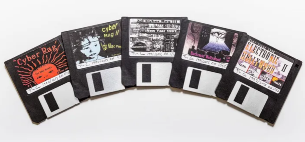
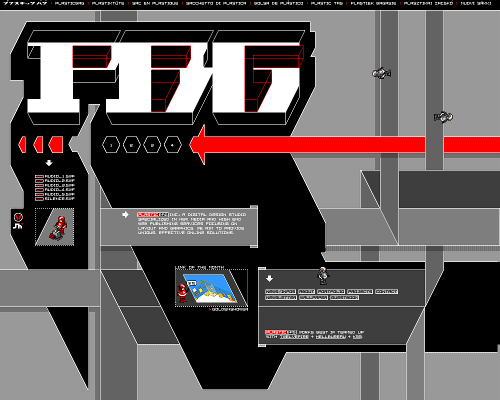
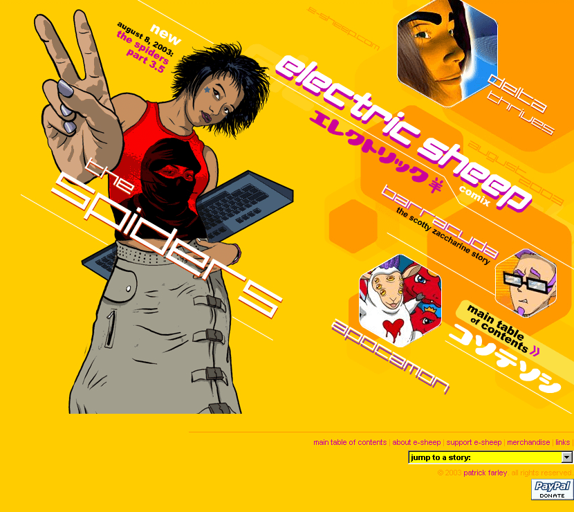
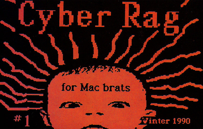
Jaime created and published the e-zine named Cyber Rag, a digital alternative and cyberpunk magazine on a floppy disk in the first years of the 90s. The magazine is part of her artistic counter-culture production and a major statement of early digital art in public galleries. Her creativity as a digital artist went onto producing in 1993 an interactive press kit for Billy Idol’s album titled Cyberpunk.

In 1994 Jaime was working at IBM as a UI designer while at the same time producing an animated series called Cyber Slackers, and it’s here we see a major contribution of online content as one of the earliest productions seen on the web. This idea were coming from brainstorming sessions Jaime would have with her friends while in New York, creating new things way ahead of their time getting inspired by real life.

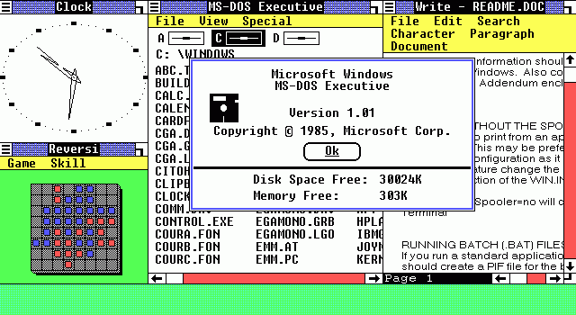
It was while at IBM Jaime was introduced to their web browser Mosaic for the first time, understanding how the importance of dynamic content would play in favor of her creativity, so she begun exploring HTML and followed that path boosting her career and work output.

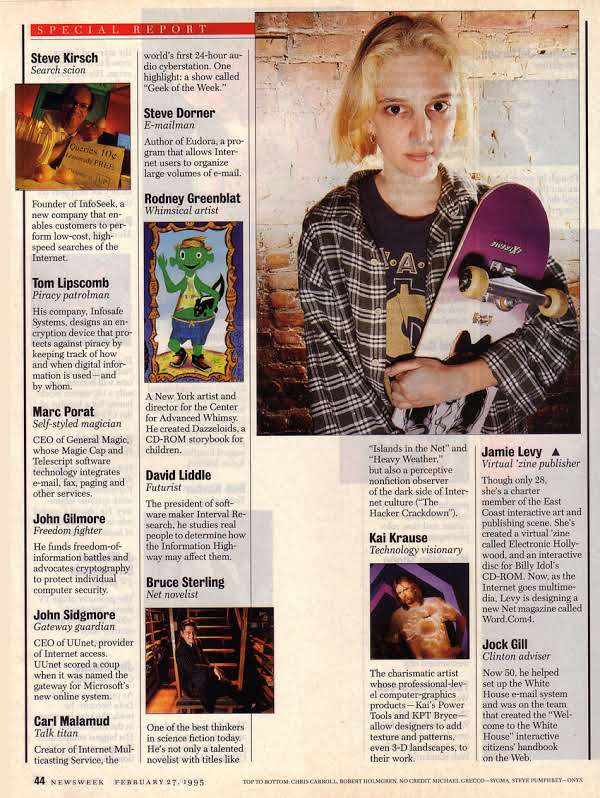
She landed a creative director position a year later at Icon CMT, there Jaime started creating Word.Com online magazine receiving praise and recognition for the structure content. Her constant effort and creativity eventually allowed her to be recognized by Newsweek magazine in the Top-50 people in cyberspace, then features on TV in Good Morning America as The Most Powerful Twenty-somethings int he US.

Having the ability to read a magazine online was unique for the time. Web pages that were usually static and written just with HTML (CSS came later), were suddenly enhanced with animations and sound making interactivity the main feature of these contents. Web users were exposed to new type of media giving them the power to be in control of what they were reading.

Looking back at Jaime’s accomplishments it’s possible to see how much she pushed the envelope of digital creativity, and how successful she was in influencing Silicon Valley with her ability to develop content and leverage the web as a major distributing platform.

Jaime wearing sunglasses.

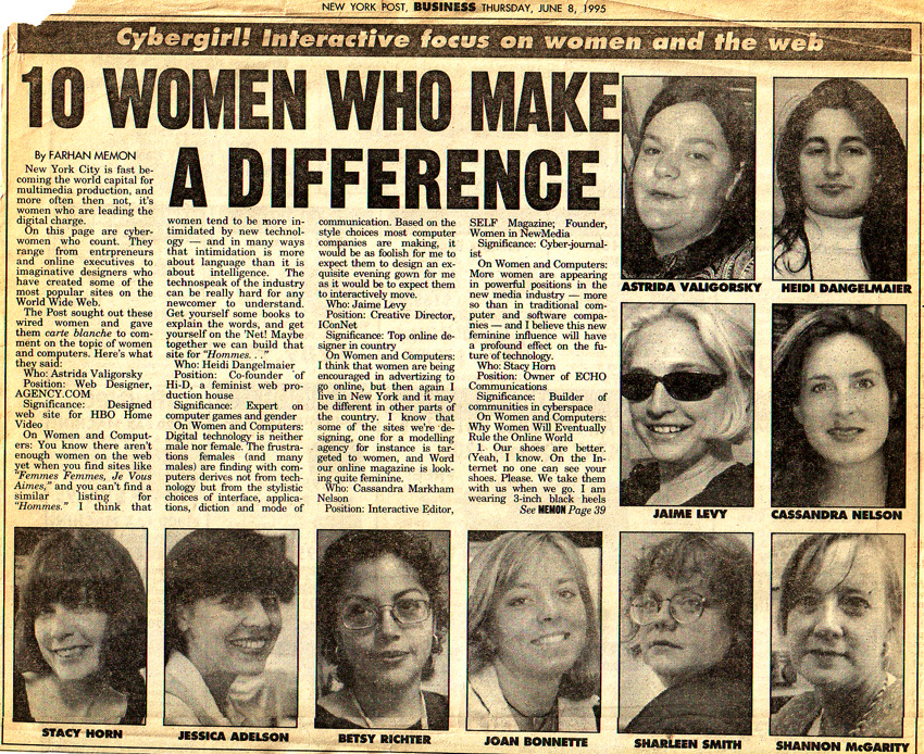
Thirty years ago the general consensus towards the internet was limited considering it a thing for nerds, something quite of a niche involving specific groups of people dedicated to tech stuff, nowhere as close as radio, TV, press, with their coverage and influence. Along with other women in tech, she was featured multiple times on newspaper and magazine for her ability to change the status-quo of the cyber space.

As a pioneer of interface design and early digital online contents, Jaime continuously experimented with her work. A roller coaster of opportunities and failures chiseled her career by becoming an influential creative before anything else. At heart she is an artist experimenting with technology, pouring out the postmodernism narrative of the newly globalized society using computers to change the culture.

First issue of Cyber Rag only on floppy disk.

As the 90s flipped into their second half things started to change for Jaime, and after leaving Word.Com confident in finding a new role in another company to continue innovating the web, but unfortunately it didn’t go as planned as the drums of the commercial internet phenomena started to drown in noise all her work and creativity. There was a struggle to create more and more relevant content as the web grew exponentially quarter after quarter.

After looking around she moved back to California in LA with a deep sense of uncertainty, leaving behind New York and major efforts in Cyber Slackers with her published content and art works. From a nice Manhattan loft to somewhere in the city of angels performing freelance gigs.

Perhaps returning home was a rushed decision, some of her friends and former colleagues remained in New York as the east coast of the US started becoming the second hub of tech innovation: several design companies such as Razorfish would become important players in this industry. Jaime did reflect upon this, asking herself if she would fit or if these companies were ready to handle her.

But why didn’t we see any of Jaime’s works in the last years or did we hear of her? The majority of her creations were stored into mediums we no longer use, they haven’t been distributed beyond their original format and the last time I used a floppy disk was 2003. Jaime’s work isn’t for the masses, it’s a dedicated crafted art that found through the digital medium its purpose, also cyberpunk wasn’t for everyone and as a movement it was dwindling down yielding to other socio-cultural happenings. But also the Dot Com Bubble had just blown crashing the markets and creating a black hole where company investments suddenly disappeared into thin air.

First edition of the book from 2015.

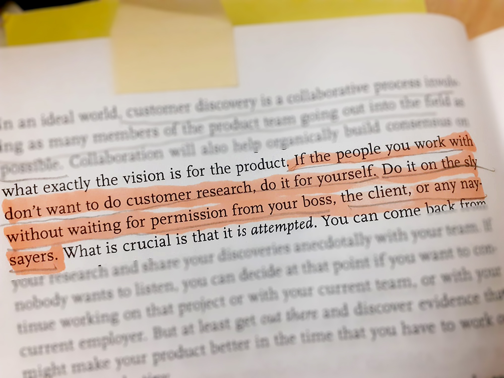
In 2016 I was searching for some reading material on UX design and many online users were suggesting UX Strategy by Jaime Levy, published by O’Reilly Media (ISBN 1449373003). The book is a very good set of information that are well explained and layered out, illustrating with real cases how to create experiences for brands.

After finishing the book and taking many notes and sticking plenty of bookmarks across pages, I went on with on with my life leaving the book on my shelf. I never bothered searching for the author how I usually do, and then forgot about it.

It’s 2023 and out of curiosity decided to read Jaime’s book again gliding over the highlighted sections to test my knowledge. The book still stood solid despite the passage of time. A second edition and updated edition was published two years ago by the same company (ISBN 9781492052432 ), that is next on my purchase book and eager to see what new strategies she implemented. This is how I discovered Jaime Levy and her work deciding to write about on this blog.

A word of advice for designers.

Jaime’s career spans over thirty years of digital creative publishing and innovation that have influenced the early days of the web. Perhaps ahead of its time just like the avantgarde artists that often tend to see the future before anyone else. Getting things right and wrong is the duty of these artists without the need to be apologetic.

Jaime has continued her career in UX design providing innovation and strategy to companies like IBM, Huge, Cisco, and many more. She has been teaching at various universities in California and New York contributing with her knowledge to shape the experience-making in product design.

Categories
Product Design User Experience User Interface

Y2K design

This is part two of a three-post series on graphic aesthetics phenomena of the last decades in computer and interface design. You can find the first post here discussing skeuomorphism and its affect across software and devices.

Y2K design is that set of visual elements that slowly in the first half the 90s condensed into a vision of end-of-century aesthetics. Its main theme is characterized by 3D graphics, saturated colors, geometries, transparencies, artificial elements, and futuristic themes.

In this context the main theme is “Global” as the markets across continents opened to the world-trading influencing each other. Global Village is the buzzword explaining how distances are slowly reduced by the ability to connect people via telecommunications. This is where design becomes not just a pretty element, but a business statement without being limited by economical restrains.

The graphic design

Poster featuring 3d elements were key to revolutionize 90s graphic design.

In previous decades we witnessed flat design styles in logo making and in illustrations, contrast to how the 90s were all about 3D with computer graphics becoming the norm in business, entertainment, and home use. People could create on their very own computer simple but stunning 3D elements with software like 3D Studio Max, using this design and implement them with other apps like Corel Draw or Photoshop to make cool prints and digital content.

Cold geometries, waves, chromatic scales, metal shapes, transparent plastics, were part of the essence of the design Y2K expression, it was a synonym of the ever increasing relationship society had with technology and how beyond the year 2000 we would eventually become. Transparent materials are often seen in products and interior design to show the mechanical complexity behind the surface, natural elements are abandoned moving towards the artificial.

Objects and abstract elements blended into a 3D soup of experimentation.

Web design is in this period a hot industry with internet available to the world having the opportunity for companies to interface to the public via aesthetically pleasing websites. The UX here is limited to the basic navigation layout and the technical constraints of the Web 1.0, while UI is king here becoming a way to communicate through a strong presence of color contrasts and abstract geometries.

90s/00s home pages were so cool [Source: web design museum].

Products for the masses

As we moved onto the mid of the 90s with the commercial availability of internet, people at home began to surf the web opening a whole new dimension of content consumption, later turned into content making as the main essence of the Web 2.0.

Tech consumer products in this period have begun shrinking in size and become widely available across countries with electronic stores expanding their presence promoting stereos, computers, cameras, CD players, VHS players, and other amenities that once were a niche market.

Japan was a driving force in consumer products.

Designers working at large brands focused on developing goods with a specific futuristic aesthetic often represented by the silver and gray colors. Japanese companies like Fuji were major players in promoting Y2K design goods being well ahead of countries in the West.

I was a teenager when I started to get more and more interested into the design and the technology behind this new wave of consumer products. From 1995 to 2000 I regularly attended tech fairs and exhibitions venue in Milan, and there I started to notice a constant progression of quality and quantity across several gadgets, where the user could choose from the best brands such as Panasonic, Phillips, LG, Sony, Olivetti, Apple, IBM.

The Minidisc was apex coolness of portable devices.

It was between 1996 and 1997 the Minidisc entered my orbit and it was love at first sight. This piece of marvel was the sequel of the Sony Walkman, developed to smash the audio cassette and the CD from the markets; its purpose was to represent the latest music portability and high-fidelity. Unlike the affordable magnetic technology of portable tape players, the MD electronic wasn’t cheap to produce and to market, it required a sophisticated understanding of hi-fidelity products the majority of consumers in the West weren’t yet ready for.

Despite being an overwhelming success in Japan, the Minidisc suffered from essential flaws outside of its native markets. Because Japan always strove to stay ahead of the competition in the electronic industry, the other western markets lagged behind and were still distributing and selling old music and storage format through CD, CD-rom, floppy disks. There wasn’t enough hardware request across Europe and North America to be able to host a major switch in favor of the Minidisc. This translated into high price tags at retail stores selling MD players for hundreds of dollars, making it an expensive purchase outside the reach of many consumers and being replaced at the beginning of the 2000s by the MP3 player at lower costs.

Mr. Anderson stored all his white rabbit’s adventures inside Minidiscs. And you?

Tech companies of the 90s developed the idea how the consumer should be at the center of everything, having the possibility to listen music, talk, recording images and videos, in order to be their own producers. This is where the ‘age of self’ begins placing on a global map the user with its experience.

With the return of Steve Jobs at Apple the company bounced onto Y2K to rebrand itself. A whole new line of products took place in the consumer market by officially putting Cupertino back on the radar.

Apple took Y2K and made it their own flagship design beyond the 90s.

Take for instance the Macintosh with its transparent components as a driving force for Apple with such peculiar design, it was a statement of aesthetic to set themselves apart from the rest of the consumer product markets that were virtually indistinguishable from one another. Apple in the second half of the 90s became a wide available niche entity despite lagging behind Microsoft.

Remember to clean the poo.

Products also came in a new variety to entertain the masses, one of the strangest one was in the shape of an egg where you are responsible for a virtual pet’s life by feeding it and making sure of its happiness. Tamagotchi was weird but awesome at the same time because it provided a new user experience that would last weeks or months, not just a quick escape but a play-behavior unseen until then.

The leap forward:
video games

In the videogame industry the Y2K design was a major driving force. Sony launched the Playstation in 1994 rocking the markets. The console was a big catalyst for game developers in crafting new titles that often were influenced by the Y2K effect, further amplifying this phenomena into the mainstream.

The Y2K level for this title is over 9000.

Games like Wipeout 2097 for Playstation represented the apex of Y2K style fully embracing its aesthetic and philosophy with their cool graphic elements and gameplay. Published in October 1996, this title was well received scoring high across gaming magazines and users.

Playstation was the golden goose for Sony.

Nintendo played its cards quite well with the N64 and its Y2K variants successfully publishing a series of Super Mario 64 titles as well with the iconic 007:Golden Eye. Console developers were aggressively pushing for their complementary hardware sales in the form of cool controllers or other gadgets.

Transparent meant an added value to consumer products as a limited edition.

Console memory cards were essential for the household mental health…

The music and the Winamp era

This is the period where computers are becoming staple appliances in household across the globe, and with an internet connection users started to have access to new digital products and learn about the latest trends. Here computers started to become the serious alternative to television, not just machines to use once in a while, but an entertainment system too where all the family can benefit from it.

Sweet memories of sweeter times.

Y2K also means Winamp, a very popular music software that worked as a virtual digital stereo on your computer, there you could organize in various playlist all your Mp3 files and customize your layout selecting different skins. Back then, constantly changing skins was the wow factor that helped this software to become legend.

Winamp is one of the most successful digital products to have empowered user to manage their files and software customization. Even if Windows Media Players was a standard app in each Win98, 2000, XP, users would ditch it and immediately download and install Winamp for its flexibility, ease of use, cool factor.

The many skins of Winamp [Source: y2kaestheticinstitute.tumblr.com]

This product was a clear example of the change of times while approaching Y2K with all the commotion that was taking place. Winamp, developed by the defunct Nullsoft, showed the web how great products had the ability to be crafted by a dedicated user base rather than coming from AAA companies. An important step of the democratization process of the web beginning in that period.

The ability to have an entire folder in your computer with hundreds of songs scared radios and record producers, but we didn’t care and carried on empowering ourselves s through our desktops. We wanted to connect with the rest of the world and the web was the right instrument to influence society. It was a great time of digital discoveries.

Aphex Twin’s distinguishable logo.

Various artists contributed to the Y2K aesthetic between the 90s and early 2000 with truly amazing art pieces featured on their album covers. Aphex Twin, Radiohead, Prodigy, and Massive Attack. This is the age of experimental music and wide distribution across TV networks, but also the development of underground music scenes becoming popular like electronic music.

POP by U2 was an iconic and visually interesting album.

U2’s album POP was a condenser of those years fueled by intensive consumerism and ego perfectly narrated through the each track. The term ‘Pop’ was a recurrent trend in the West taken from the 50s/60s period of iconic creativity made famous by Pop Art with names like Andy Warhol turning painting into advertising and viceversa.

Ok computer.

Radiohead are flying high thanks to their 1997 album Ok Computer confirming the electronic sound as the main component for this period of time, becoming the official vibe of the Y2K period jading an entire generation of Millennials.

Interior design

Transparency, transparency everywhere.

Y2K interior design was achievable thanks to new materials and their applications. This period ot time wanted to encompass the use of both artificial and natural elements melding metals, plastics, and wood.

The cool vibes of the 80s neon lights were slowly fading away to be replaced with surface reflections and natural lights. This is the time frame where designers and architects come together to reshape public spaces and the workspace. Materials and their characteristics are protagonist creating the desired indoor effects.

Indoor industrialism as the cool factor.

Another essential characteristic of this design is the popular choice of minimalist geometries often influenced by cyberpunk elements. Back then the consensus was how society and cities were going to resemble utopia movie sets as we departed humanism, leaving it behind to the past and embracing a cybernetic tomorrow.

Oxford St. London’s McDonald’s [Source: y2kaestheticinstitute on Tumblr]

This particular McDonald’s in London was a spearhead in interior design proposal and execution, it worked really well in commercial spaces offering a sleek and spacious volume for customers to navigate. Y2K interior design predicates practical efficiency as a reminiscence of the Bauhaus style removing decorative elements. Although cool and practical it’s a challenge to the human brain as it seeks complex patterns and natural shapes to be stimulated.

Fashion

Aesthetic plays a major role in the Y2K fashion. [Source: Snug Industries].

Y2K fashion was about departing from the traditional makings of the past. Here we move away from the materials that have been with us for centuries: cotton, wool, linen, being replaced with acrylics, nylons, plastics, metals. Fashion made by synthetic components wasn’t just an artistic statement, it was an industry strategy to produce entire new lines of clothing for a cheaper production but with a high profit yield.

As tech products became smaller and smaller, fashion designers started to incorporate them into our daily life often believing clothing and gadgets would eventually become one entity; wearing technology was the expected and wild trend at the same time, but an accurate prediction nonetheless.

Nokia was a very important brand and influence in this period, their cellphone quality and reliability were a high standard on the market. Their products followed the Y2K design principles featuring silver colors promoting them as a fashion statement.

Other colors such as blue, gray, black, white, were used to highlight the feeling of coldness and industrialism. Patterns were removed and sleek shapes and surfaces are the norm across the Y2K design spectrum. I can’t deny how these fashion elements are inspired by the wild imagination of TV and movie productions, especially if we take into consideration examples like Blade Runner with its costumes and props.

Movies

The iconic representation of symbiosis between man and machine.

Great expectations are always placed upon movie productions to craft great narratives to inspire the viewers. It’s the case of the 1999 movie The Matrix with its spectacular vision of a modern society overwhelmed by the use of technology, with its destiny forged by machines in an attempt to fight them and survive searching for their lost humanity.

The Matrix accentuates the conflict of relying for far too long on machines by using them not as a tool but as a mean. In this context the approach of the new millennium is opening a new century of technological marvels, often forgetting how humans are still socially and psychologically evolving, and where an impact of sudden changes might bring more questions than solutions.

The Y2K vibe is also fueled by the extensive influence of computers and the power of the web. Hackers and hacking started to become two words often misused to produce entertainment, but movies can’t resist trends and buzzwords so they would jump ship and pay John Travolta to star in Swordfish.

Do not confuse it with the swordfish, the fish.

Hackers was a daring but entertaining project aiming to connect with young crowds by exploiting the current phenomena of computer hacking, something the press started finding amusing by publish more and more but without grasping its true concept.

I thought about Johnny Mnemonic but the movie is a full plunging into cyberpunk with its dystopian twists and deserves a post of its own despite possessing several Y2K elements; Strange Days uses the same concept of hacking the brain as the ultimate tool to go beyond reality and the human limits. In this creative work frame projections and dreams are encapsulated into their technological capability to be reproduced, much like a painting or a play can be recorder and viewed through out electronic capabilities.

Last stop

Y2K has multiple elements ad genre that go well beyond what we described here. It was a period of time where technology and its lure pulled us into this synergy of extended futurism and consumerism. Y2K design was characterized by the vision of tomorrow that brands and creators envisioned over 25 years ago.

Personally, I’ve always enjoyed Japan’s vision of Y2K for its capability to propose on multiple levels a whole new foresight of creativity and innovation. Consumer products, entertainment, fashion, wanted to distinguish themselves from the past decades by promoting the ‘synthetic’ as a pivoting platform for new proposals.

Y2K design will forever be remembered as the essential aesthetic and functional phenomena that condensed multiple characteristic. It wasn’t just a visual experience but a way of entering the future we are living today.

Happy wireframing!

Categories
Brands Product Design Psychology User Experience User Interface

A look back at skeuomorphism

Skeuomorphism is a term used in technology to describe digital elements that replicate real life objects to enhance their purpose and visual characteristics generating a specific aesthetic. There have been plenty of applications in the past thirty years that opted to replicate something we see on a daily basis, and despite being visually pleasing it’s not the best choice for interfaces.

This design applies to software that pioneered its UX and UI essence to stand out from bland element shapes and colors, gaining popularity through 1990s as software developers believed digital interfaces should imitate real life environments to facilitate the user. Some used skeuomorphism to build interfaces with the intent of standing out from the rest of the competitors, others just went along the trend and often created unpleasant design experiences.

Microsoft’s BOB in 1995 wanted to be the main interface for Windows.

Skeuomorphism and 3D

The purpose of skeuomorphism is to facilitate the user by creating 3D or realistic user interface elements with the purpose to stand out, reproducing a familiar environment, and to be clearly visible by different experience. However, the abundance of elements in the UI doesn’t help understanding how we can clearly accomplish our tasks.

Backed by Y2K design influences, skeuomorphism peaked with Apple’s products between 2010 and 2015, but was also a major driving force for Microsoft’s OS such as Vista, 8, and earlier for Windows XP. Designers and developers toned down the use of skeuomorphism by only using 3D elements for program icons, leaving the background to a much clearer operational state and adopting a much neat desktop.

Through time icons became cooler with more details upgrading the visual style both for Microsoft and Apples products, and everyone at that time thought this design style would be the next big thing in terms of UI; however, it turned out to be a massive load of information for the user to digest and understanding which features can be interactive and which not. Spatial and element disorientation made it difficult for users understanding the interface layout.

Even the trash bin got cooler through the years.

But does it fly?

Skeuomorphism is aesthetically pleasing but places an excessive cognitive load upon the user, and some styles tend to be more detailed than others increasing the hardware and software requirements for the app to run, thus more energy translates in less battery life for the device and lower user expectations. Apple has always been a great fan of skeuomorphism and IOS 6 was peak design representation of realism for this style. It worked very well by impressing the audience when the iPhone was launched as users would interact way more often with these elements compared to their laptop or Macintosh.

Good looking but it’s distracting.

Because we’ve been using our smartphones more often than previously thought, Apple understood they were visually punishing their users with an excessive amount of details for each app. Notes app, Newsstand app, Voice Memo app, they all featured high elements of realism to stand out from their competitor and wow the user. Skeuomorphism is detailed with elements to enhance the high fidelity of real life objects, but here comes how the aesthetic portion will affect the usability of the product confusing the user over what it’s possible to use and what’s not.

Yes, skeuomorphism is nice in small doses and might work well within specific apps that require a certain degree of realism in their UI. Music software is a great example because the depiction of physical equipment connects right well with users: an amplifier, a guitar pedal, a mixer. They’re all technologies that are still used today existing in parallel with their digital version, and they also tend to change very little through time compared to other mediums.

Which features can you interact with and which one are just aesthetic?

Do we really need this type of realism between the analogical and the digital world?

I don’t think we do as much as we needed in the past as today’s users are more trained and prepared to understand software elements. Yesterday’s skeuomorphism wasn’t just a pretty aesthetic feature but rather a teaching element helping users recognize their tools in a faster way. A yellow paper with rows of lines immediately pushes the user to think about a notepad, a shiny metallic gear represents the setup icon to make changes to the device, and so forth.

Replicating the plastic keys of a computer keyboards to be tapped on a touchscreen was Apple’s idea to reduce the onboarding process from those who used physical pads, for example Blackberry users, making a statement about their products by pushing for a full digital experience.

IOS toned down the realism to provide more clarity.

However, skeuomorphism with its elements has the power to saturate the eyes faster than a simpler UI approach, and that’s why over the last ten years a rise in popularity of minimalist design was protagonist in the markets. Simpler is better because it plays easy on the cognitive load, especially since we use our smartphone as a tool for multiple purposes for hours at the time on a daily basis.

Can skeuomorphism exist outside its environment?

Realism and 3D elements are characteristics of skeuomorphism and are visually recognizable from the start. The high details levels and sense of aesthetic is a peculiar leverage standing out from the rest, this will set this style apart from the rest, meaning skeuomorphism is bound to its essence and will clash if paired with other interface models.

Skeuomorphism comes in other flavors and is a strong ingredient in videogames because it represents the optimal intersecting point between realism and 3D. The user perceives a direct connection with this design as different elements bridge the two sides, and this choice of style enhances the experience of the player not just in the dynamic game play session but also with static ones.

Note the map details with the seal stamp on the bottom-left and the name of the printer on the bottom-right of the map. [Dishonored 2– 2016 Arkane Studios]

A new trend has seen a soft return of skeuomorphism under the name of neumorphism where there’s a mix of 3D elements in a clear environment of distinct design style. Personally, I think it’s a good modern option to consider if flat design is fading out, but not all software can benefit from an aesthetic change as the UX behind is the main mechanism for the purpose and functionality of the product.

Neumorphism is perhaps what skeuomorphism was intended in the first place.

Skeuomorphism and logos

With the late changes in design trends, many brands opted to abandon skeuomorphism to adopt a minimalist approach to refresh their status quo. It’s the case of web browser Firefox by Mozilla that evolved from higher details and an aim to realism to a logo representing a fox wrapping a globe, where for every reiteration the details have been removed.

A Firefox is actually a red panda, but it would be difficult not to think of a fox.

As time goes by the skeuomorphism phenomena lost its appeal with designer seeking more essential shapes and contrasts rather than an overabundance of visual stimuli. The race for simple and cleaner logo began across multiple industries, affecting a domino effect from other companies.

British Telecom went drastic in their logo change to a simple purple/white duo.

Skeuomorphism placed a great emphasis over the last thirty years in UI and graphic design, so much that it prompted the industry in opting to flat design choices. As we live in a minimalist design era where we abandoned textures, details, complex patterns, to decor our homes and cities, and with the fact sleek and smooth design seems to be the latest trending choice. I wouldn’t be surprised if skeuomorphism comes back to provide a physical connection with products and services, maybe as an antidote to the abstract gesture and interactions our devices are being developed with.

In essence, skeuomorphism is a cool highly packed and detailed design that wants to mimic real life elements with the intent to provide a unique experience for the user, but that at the same time loses practicality making it a poor UX choice especially for today’s technology where everything it condensed on smaller and portable screen devices.

Happy prototyping!

Categories
User Experience User Interface

Easy peasy

I typed “easy peasy” into generative AI and the image above is what I got, but it’s got nothing to do with this quick posting because I’d like to point out the obvious that yet is still in need to be addressed.

What’s this about, you’re asking? I’ve been using computers for 30+ years and there are still doubts over simple UX/UI rules in the industry; so let me start from this statement: design for your grandma.

Why should you design for your grandma? Many products end up in households where users have nothing to do and have no knowledge how their purchase was developed.

Imagine your grandma having to deal with the latest smartphone you decided to give her for Christmas to stay in touch. Your heart is in the right place and you believe the latest technologies can win obstacles and simplify things.

Wrong! You’re complicating the experience and alienating the user from the product and sophisticating even the smallest task such as making a phone calls. We’ve been there, just don’t again.

To develop successful products you need to start thinking as if the user if a 5-year old or a golden retriever. Start with small interactions and task achievements to build the basic functioning of your project. This needs to be addressed and in the future I’ll write a more extensive post.

But let’s think small and address the very basic communication gap that still persists in software development, mostly because companies delegate the whole process to software developers avoiding hiring product or ux designers leaving behind important researches and prototyping.

Yes, it can happen to you.

Alert and message boxes are essential to comunicate the user critical decisions to take that will affect the outcome of the task. Take a look at the pic above where the buttons to click are written in Japanese, now you can roll the dice and believe the left one is Ok and the right one is Cancel. No, because you don’t know if that Japanese text was written right-to-left in its traditional form or the other way around. Don’t gamble, run your UX tests before the commit.

Motherf…..!

Now, there are developers who really don’t care about you and there’s a special place in hell for them. The above message is quite important and yet it manages to confuse you, providing more doubt into the user’s mind and fogging up the decision making: what am I cancelling?

It’s that simple, yet…

Don’t complicate user’s life, make the task achievable in the shortest time possible without generating doubts. Software is created to simplify our work and developers ought to make it easy on decision-making. The question is simple and so should be the answer.

If I catch you doing this…

Yes and No is a binary selection over a positive question, but often we find more information inside of it that requires a choice in that action: this or that? Therefore we have to adjust the answer output to match the task request so the user can provide its preference.

Pay attention to the message.

However, some software present redundancy in user’s input becoming overzealous and taking too much time, especially if the app is slow because it has to access a remote database to complete its task. In that care lag is a killer but what can you do, impatient user will slam on the Yes button until they stumble on a bad request just like the picture above.

Clear options for clear actions

So, to avoid smashing the Yes button, we can provide engagement by asking the user to make a specific choice when there’s the need to take a specific action. The above image is asking “Do you want to exit the program or close the file?”, in this case the user wants to stop using the software and turn off the machine or it was a mistake. This feature is telling the user: “I know you want to quit, but are you telling me to shut down the software or you wanted to close this file and continue on something else?”.

You’re probably asking yourself:”But what if I want the third option and Cancel?”. Don’t add a third button called ‘Cancel’, instead allow the user to click the X button located at the top-right corner, it’s universally acknowledged how that function works, meaning: close the message box and continue working, but most likely you haven’t saved your work and unless you have an auto-save feature, then press CTRL+S if you’re running Windows or COMMAND+S if you’re on a Mac.

In the end, easy-peasy wins the race reducing the onboarding process and avoiding the cognitive overload onto the user. Tasks shouldn’t be developed with excessive thinking, especially when we deal with a complex software that requires major resources and long hours from the user side.

Happy prototyping!

Categories
Foresight Product Design User Experience

Little steps, big leap

The process of product development comprises a variety of steps that each have their importance to understand and produce for the user. Every product is different with its purpose and output so the evolution stage will present with different challenges that might influence your approach. Designers shouldn’t be afraid when starting something new, it’s normal to doubt how some aspects of the process will turn into cheap shots making the work harder. This is normal and there isn’t a solution to this common issue, but rather a set of experiences that can build your confidence into reducing stress and help you along the way. Should you find a moment of weakness or doubt, pause and reflect to address your location on the map, this will help you strengthen aspects that are often discarded within the design community.

Consider the following when the need to create something new arises:

  • The research phase will be long and require more resources than you think: new products require you to explore new areas that you never had the chance to visit. You are going to spend more time looking for your topics than analyzing them to extract what you’re looking for. This requires you to balance resources so you don’t  spend too much time in your earlier stages.
  • Data redundancy will be constant: while collecting elements you will find similar data among your team that creates the tendency to expand conversation and time dedicated discussing the information. Everyone during the discovery phase feels compelled to provide their experience and findings increasing the data quantity and its repetition; pay attention to what information is essential to the existence of your product and leave the rest for later.
  • Create an early proposal: once you gathered enough data in the discovery phase you should create an early proposal to the stakeholder to understand if you are on the right track. This saves you time and budget because nobody is happy to find out they got it wrong after five months of work.
  • The product you’re developing is just the first step: this important aspect is often overlooked. You are not developing just a product, you’re establishing a practice method to build a longer path for you and your client to develop business opportunities. This encourages you to be open, to foster broader ideas, to plan ahead, and to increase client loyalty benefiting both parties. Foresight is a vital part of product development because within more complex environments, you will have to interface with System Designers, Compliance, Legal department, to make sure everything is safe and sound.
  • Team brainstorming is vital: it doesn’t matter if you are working in a small or large team, or if you are the only designer working on the project. The important thing is to brainstorm with other colleagues such as developers, product owners, tech department, to understand their point of view and how their input can enrich and assist your development process.
  • Increased focus on lo-fi testing is better: designers have the tendency to show the pretty interfaces so they can convey a richer sense to stakeholders by having hi-fi models. Take a step back and make the lo-fi or skeleton system work first like clockwork, it’s easier this way because your focus is on the basic working mechanics: before you can run you need to walk.
  • Stakeholders are your friends: as I mentioned a few lines earlier, sharing information with stakeholders allows to keep them in the loop and welcomed in the process. Empathy is your best friend and you will look like a considerate designer that can take care of people, products, development tasks, acquiring more awareness and important feedback.

Product development required the creation of an experience satisfying the user’s needs and client’s expectations. Remember to stay focused on who is the user and what are the essential key points to make your product viable first and scalable later.

Happy prototyping!

Categories
Brands Companies User Experience

Unchoking

Yes, this is another post about Microsoft and its competitors. IF you don’t like a long read then jump to the bottom of this post, but if you instead enjoy reading what’s cranking my gears get comfy and make some coffee or tea.

It’s the summer of 2008 and everything is starting to crumble into pieces on a global scale. Plenty of business people are glued on their Blackberry witnessing the stock market crashing live, they’re all sweating and they don’t know what’s going on despite their knowledge or whatever economic book they read at college isn’t making any sense at all. Lehmann Brothers is out, gone, the company was left with any chair to sit on when the music stopped. Who is next? Bank Of America? No, too big too fail, but so they said about LB and AIG. The world is collapsing, it’s another black Monday-Thursday-whatever all over again. It’s down to the seconds to pass the historical TARP bailout or the western world is gone.

If there’s one thing we’ve learnt from the 2008 financial crisis or any other major similar event of the past, it how the information is distorted when information channels are few. We can imagine on a X/Y axis the inverted trend taking place: the more information channels we have, the more the tragedy seems different from when it was told. But this didn’t stop bad things from happening again, and we won’t discuss about Silicon Valley Bank or Credit Suisse; we will discuss about what it takes to become relevant again even if your name was never forgotten.

Flashback

This is the story of how Microsoft got its groove back and how ‘maybe’ the public will perceive it equal to Apple, but it’s not the case; however, it’s worth the try to explain why we find it difficult to place together apples and pears. Pun intended. So, trying to elaborate something far too fetched and philosophical, I’ll try my best to illustrate how the situation is and how it might be for the next ten or so years.

In my February’s post I wrote about the missed opportunities companies like Microsoft have lost to lead the tech race of consumer’s products. This feels like a second part to the original post and I’d like to find closure along these lines to close this chapter. I don’t like to beat -too much- the dead horse but in order to write a clear thought you’ll have to bear with me in this journey.

When tech companies from Silicon Valley started to become big across the 70s to the beginning of the 80s, very few would have predicted the establishment’s strategy in a world where Moore’s Law was far-far away. So, if you look back at that famous and alleged statement attributed to Bill Gates: “68kb ought to be enough for everybody”, little he knew how wide the horizon was expanding beyond his office desk.

As Apple -the underdog at the time- challenged the world and especially MS, there was no economical predicament to how big a company could and would expand in the tech sector let alone in its financial aspect. With MS establishing itself for decades as the king of the hill of the home PC and software solution, others were swept and dramatically beaten to the punch of chips and transistors. There was no second place in this business unless you carved yourself a niche steady place on the market, and that’s what Apple did in order to stay competitive.

For years Microsoft stood still overshadowing the global computer market with Windows and eventually its web browser Explorer. Whether it was sheer luck of sheer theft, the windows system felt the most sensible solution for the PC consumer segment, giving the ability to introduce a new addition to the appliance set inside millions of homes everywhere. The concept of a piace of technology being used by everyone that wasn’t a television was the star of the starlet of the 80s and the celebrity of the 90s.

“Whatcha thinking?” – “Nothing, just computer stuff”.

The decade of the 1980s was for many the age of consumerism and the need to have more, to buy what the world had to offer without putting boundaries from where it came from. Buy Sony’s Walkman, buy American computers, buy German cars, and so forth. This was fueled by an increasing spending in the west that pushed public debt to whole new heights, credit cards were in everyone’s wallet and travels cheques were used like sugar in sodas. It was this decade that allowed companies like Microsoft to expand their operations and retinue abroad along with other US corporations like Nike or McDonald’s.

After two Ronald Reagan’s presidencies, Rocky 4, and the collapse of the Berlin Wall in Europe, things were about to change for Microsoft. The reunification of the two Germanies and the collapse of the Iron Curtain with Russia in 1991, were the preambles of a new free range of market ambitions through product placement where no family had ever seen a PC. Imagine all the countries that once where part of the USSR: Poland, east Germany, Czechoslovakia, Hungary, the Balkans, now representing a fresh opportunity to provide Windows as their standard operating system (talk about communism…).

So, Bill Gates and his pals at Microsoft were celebrating a whole new market to conquer and control from Berlin to Moscow, with millions of new MS users to become and to stay for quite a long time. It’s the 1990s and internet is happening slowly but everywhere, connecting the dots from country to country with virtually no boundary set in the middle.

What about the apple?

Meanwhile the PC world was growing in this period of time, Steve Jobs and Apple divorced in 1985 and ultimately he set his eyes on the next venture with a new company called Next to provide quality computing to a niche market. This is the second attempt Jobs planned in the tech business by carving out his own very spot next to MS, there was no doubt Apple in the first place would try to reach their numbers and Bill Gates was sure of that.

In 1996 next would close his run after just only ten years of activity trying to place across offices and universities practical but expensive computers. After all, what could Next machine do compared to Microsoft? We have to admire Steve Job’s resilience in his quest to bring quality computers onto the consumer market; however, PC at the time weren’t cheap to buy and trying to justify an Apple or a Next product for the average family was a very hard task to accomplish.

1989 to 1999 was the liftoff decade of Microsoft.

It is the 90s that saw Microsoft acknowledging its popularity with a constant growth that begun shy in the first half, only to jump high in the second half of this decade with its stock value steady upward. But it wasn’t on quality that Bill Gates made his fortune, it was about quantity and the number of Windows and Explorers copies installed and sold in the international market. The monopoly of cutting out any competitors made the fortune MS is now enjoying.

The release of Windows 95 and later of Windows 98 on the computer market were the one-two steps to a major jump toward the closing of the century, and onto many new things for the upcoming new one. Despite the poor reception of Windows ME and Windows 2000, Microsoft will turn the tables around in its favor releasing the acclaimed Windows XP at the end of 2001.

It is at this point that ten successful years of Microsoft made the public believe no other company could surpass that or even establish a small parallel market. The 70s and the 80s were over, there was no more room to experiment in every direction and the age of the monopoly was at its peak with MS dictating the rules and overshadowing everything. However, a twice-defeated Steve Jobs received a third chance when in 1992 then Apple CEO John Sculley was pushed to resign from the company. Cupertino mama had enough of cheap tricks coming from cowboy executives trying to split the company to make personal profits. Apple wanted its status quo back of niche computing for the few selected able to understand its flavor, away from the store shelves, it wanted to be more than unique anche they understood the only man able to turn the tables would be Steve.

Think Different. A motto that really worked well for Jobs’ company.

Apple would do things differently as Jobs came back and this time was different with the next ten years dedicated to a whole new product philosophy; it was about creating not just a line of products but a creed to good product to cater the best of the best technology could provide to millions of users. This didn’t arrive until the second half of the 90s when things started to turn around for the best, but first Apple had to come out of its jungle understanding they’ve been chasing a repetitive design approach for years that never could distinguish them from a PC.

The various Macintosh desktop like the Centris, LC, PowerMAC, never really stood out from the crowd of other similar computers unless you’d get close enough to spot the colorful apple logo; beside, they all look white and boxy or greish, virtually indistinguishable from a Windows PC. This was a major epiphany for Steve Jobs, he understood that in order to let people experience the true niche computer flavor he had to fool the eye first.

Overtaking

I’ve never bought an Apple product except for the white wired headphones for the iPhone I still own today; it was one of the best tech purchase I’ve made in a long time and its quality reflects the $40 price tag. People around me grew very fond of Apple’s product from smartphone to notebooks, the iPod was very seducing at the time and its cost too forbidding for my pockets. But purchasing such a product meant you’d be set for many years for the quality and reliability beside the design aesthetics. Nonetheless, when Apple started developing its own ecosystem to encourage users in getting more of their products, something funny was about to happen.

While Microsoft continued to expand after its success of Windows XP, the company also tried to compete with other products by entering the music industry with their Zune player in 2006 and with the Windows phone in 2010. The public and the tech press wasn’t sure what statement MS wanted to pass by competing very late with two products Apple already established years before; in fact the iPod had been around since 2001 and the iPhone was launched in 2008

I can’t stress enough the fact how big companies trying to lead the markets at all costs often stumble in the process only to chase the competition. Why is that, why does it happen? Microsoft has been leading the computer market for decades, the virtual monopoly of PC with their pre-installed OS provided the company with a sense of omnipotence that has the tendency to make you blind over the simplest things under your nome. MS believed their millions of users already owning a PC would automatically buy Zune or the smartphone out of a consumer loyalty taken for granted.

Too fast, not too furious. Zune placed little effort in its product abilities.

By this time Apple had concluded the 90s with its cycle and pushed the company onto the highest it’s ever been and able to print money. The iPhone, iPod, the Macbook, the Macintosh, they all came full circle in establishing not just a series of powerful products but the alternative to a market where Microsoft had been leading for far too long. Jobs knew that it was necessary to spawn a new set of eternal rules for Apple with the creation of products well above the market average. When you pick up a Macbook there’s immediately a sense of tasteful thickness and quality other brands don’t convey, you can feel this product was developed on another planet far enough to share virtually nothing with its competitors.

We all know that buying Apple’s products is the equivalent of being chauffeured to work rather than taking your car or riding the subway. You’re getting an experience that goes well beyond the average PC quality and all at a cost; this is what establishes the company apart from the rest of the hardware and software by outsourcing nothing outside its walls. Steve Jobs made it back 110% from that distant day of 1985 when he was expelled from Apple by Sculley. Design became the main focus behind every iPhone or Macbook developed in Cupertino with a unique approach to innovation no other business had ever undertook. Sadly Steve Jobs passed away in 2011 after a long health battle against cancer, and for many Apple peaked during his presence establishing his enterprise as a beacon of design principles amidst a foggy sea.

A sunset


Microsoft continued along its path despite the lawsuits it faced regarding their OS monopoly over the PC market. The disappointment of Windows Vista in 2007 and Windows 8 in 2012 didn’t help the company to win sympathies nor the required confidence to win public’s in addressing the main issue: where is MS going with this? Thankfully the stride of poor OS was interrupted with Windows 7 in 2009 and Windows 10 in 2015, two solid programs that managed to makeup for their previous antagonists and their lackluster effects on the consumer market. Or did they?

Windows Vista was a sore eye for Bill Gates with the OS following the very successful Windows XP after years of user happiness. Although we could manage the ferocious permission request of administration privileges Vista kept asking and mesmerized by the desktop activity slider; the punch in the gut was Windows 8.0 that suddenly alienated millions of PC owners around the globe. Its tablet-like interface wasn’t intuitive because the majority of the public out there at the time didn’t have enough experience using a tablet, let alone an interface that pushed the user to leave keyboard and mouse. To make things more challenging, Windows 8 featured a button on the taskbar switching back to the old desktop and Start button setting further confusion among the userbase, and as a OS this 8th iteration was pretty much disliked by a large portion of users.

Microsoft had chocked itself in the second half of the 2000s letting precious time and resources go to waste in order to create yet another product either too early for the markets, or too weak to grab enough attentions from the users. In fact it was pretty obvious Microsoft rushed Windows 8 wanting to emulate Apple’s iPad, as if suddenly desktop users didn’t matter anymore or would disappear the day after. It’s at this point -once again- that the peculiar thought crossed my mind:”Has Microsoft given up? Did they reach peak performance?”. Just like any human being, society, empire, they all reach their maximum height at a certain historical moment and after that they cannot continue any longer slowly riding towards their sunset.

Is the end THE end?

In the 1971 sci-fi movie THX-1338 by George Lucas, at the end of the story the protagonist Robert Duvall emerges from having lived in an underground city his entire life seeing for the very first time the sun and the sunset. Perhaps we can use this analogy to describe Microsoft’s journey after all these decades, where it’s the end of an era for the company and walking towards the sunset is often a metaphor for ‘the end’; however, in the movie we don’t know if the protagonist survives the night but we know that when the night comes we take such time to think about the day and all that’s happened.

Microsoft isn’t done, it persists. Despite the continuing rise of its stock value until today, the company found it extremely challenging to enter the new century much like the new kid on the first day to school: awkward, stared, alienated, judged, watched by many, estranged, what now. This is probably how Microsoft felt entering the 2000s with the whole world asking:”What many great things will MS bring us?”. No pressure, except a lot of it. But sometimes great and enormous pressure is able to create precious stones.

Secretly

After developing all kinds of applications and services ranging from the home consumer to the business market, Microsoft had created for itself a lengthy portfolio across several decades forging the PC world. On the other hand, Apple has continued a relentless pursuit towards its vision of design perfection that spawned a ‘religion’ off its brand, a dedication to extensive attention to the user experience and to the results it delivers. Ken Kocienda writes about this process in his 2018 book Creative Selection: Inside Apple’s Design Process During the Golden Age of Steve Jobs, explaining the detailed attention in the selective process of building up the digital keyboard for the use while developing the iPad, there Jobs would constantly put his team under pressure so they would understand and the intricacy of their design to the minimal aspects.

It would be too late now for Microsoft to turn around and begin a similar process of extensive user research over their product development; but why? What Apple stood for was ahead of its time on a grand scale. Creating hardware and software for a niche markets when computers barely started entering homes and offices was a dare, but the great gamble paid off when the market was young and naive. Today there’s virtually no space for the type of innovation Apple provided over the last 20+ years, now they’re off to healthcare, VR, and payment solutions; the iPhone cannot receive any major significant improvement anymore and their Macbooks won’t get any slimmer otherwise they will lose purpose from the technological point of view.

After a long and zig-zag journey of OS publishing, an under performing web browser, an ignored search engine, Microsoft decided it had enough of the second place and in secret the company decided to invest in an industry almost forgotten by the media and the public, let alone by the tech industry. Perhaps at Redmond WA somebody slammed their fists on the table during a meeting scaring the nerds into a corner of the room, and perhaps it was a good thing if this happened. Someone had reached peak disappointment levels and proposed to invest on Artificial Intelligence while everyone looked at that person in the most alienating way. Whether this is the truth or not, something clicked inside MS’ head to move over new pastures where no grazing have yet to be made.

The Covid-19 pandemic played a key factor for many companies to rethink their corporate strategies beside their smart working solutions. Microsoft realized that with their empty offices they could focus on working on something very secret, splitting the projects and work loads among employees and teams working from home and lessening the risks of internal leaks. By having different units working on the same project they won’t know what the great picture is really about.

“Microsoft secretly investing in artificial intelligence” that’s the prompt for Stable Diffusion I used to generate this image…

In the fall of 2022 the press and the tech industry were getting drunk on the Metaverse juice with all its possible applications and side quests. Articles upon articles were published that year praising the next dimensions of the internet (I did too :)) and its integration with blockchain technologies. The party ended when in this time frame we start seeing odd publication of warped images generated by AIs of different nature: DallE, Stable Diffusion, Midjourney, entered the ring as heavyweights ready to disrupt everything digital. But wait, there’s more! ChatGPT followed suit upsetting all copywriters, SEOs, social content managers, and this was just the beginning.

Microsoft didn’t care but it would very unwise of them not anticipate this within a carefully planned strategy; after all, their social platform LinkedIn would only benefit from task and content publishing automation by removing obsolete Monday morning selfies posts about ‘self-empowerment’ and awful self quoting motivational e-cards from boring unoriginal users. But this isn’t about the sprinkles or the icing on the cake, this is about the recipe that holds together the ingredients and how they will eventually taste.

The surprise continued when in January 2023 more news were released about MS and AI with an understanding that it would impact several IPs such as their browser Edge, Bing, and eventually spawning a new method of assisting users with the power of artificial intelligence when using Microsoft Office. Clippy 2.0 if you remember that little animated assistant on the top-right corner of your screen. As the weeks went by with more information bouncing across websites and social platforms, we faced the uncomfortable truth of the rapidly growing use of AI. But that didn’t matter, Microsoft hand chained up a series of investments and deals with ChatGPT and OpenAI enough to secure a leading role and a major leap ahead of Google, Meta, Apple. Suddenly MS isn’t stared at like the new kid in school anymore.

Categories
Product Design User Experience User Interface

Cards, funny and easy tools

UX cards, often disregarded, are actually a fun activity to include during the development process for its powerful visual impact.

Why do I need cards? They are a leverage point in your favor helping a transition from the UX to the UI process, especially when you need inspiration or a preview of your results.

Cards don’t have to be boring, they can be fun and represent an opportunity to experiment providing a glimpse of what the final product might look like.

Play with your cards, we might say, and test your work to find new inspiration when you find yourself stuck.

Happy sorting!

Categories
Brands Companies Product Design User Experience

Developers, developers, developers! How we left a gap in making better products and services.

It was at Microsoft Windows Developer conference of 2000 where former MS CEO Steve Ballmer chanted the magic words “Developers, developers, developers!” soaking in sweat trying to prompt the large crowd of the event. It worked and that moment in history became a meme for the ages to share.

Developers, yes, but what was Microsoft’s angle back then? During that live event, Windows XP was being finalized to be released the next year, the XP as in “experience” for the total renewal of its approach on the PC operating system that would become an immediate success. Users left behind the dear Windows 98 and the forgettable Windows 2000 and Windows ME.

I remember quite well those years and the PC distribution suffered from the customer perspective to the point people didn’t even realize there were two OS between Windows 98 and Windows XP. Really? Yes, the potential wasn’t living up to standards of what the average user actually needed, and here we are talking major OS operations forgetting the user experience.

Has Microsoft ever proposed a UX to grace PC users that grew discontent over the years because the excessive weight was put towards developing useless apps? It took decades to provide the average MS user the ability to use a PC without asking their kids or grandkids how to connect to the internet, how to install software, and how to find specific but essential information like the network name or the network password.

Seems pretty jolly work for today’s standards, yet while MS users suffered in pain across the 90s and the 2000s because of poor software feedback and other UX malpractices, Apple and Linux were taking notice from afar watching every step Microsoft took. While Microsoft followed the typical strategy of overwhelming the user with as many features as developers could come up with, the actual user was just looking to write documents, read email, doodle with MS Paint for fun.

Windows XP was the right approach to a friendly UX, but despite its success, its direction was discarded when new projects were released.

Windows XP had the right pedigree to become a beacon for users in experiencing a better software environment: its colours, shapes, icons, features, were right and users felt comfortable around a new OS development approach. We can say this OS popularized and made it easy for new users to approach the digital world, especially when owning a computer at home back in 2001 when it became popular to do so.

It’s the end of 2001 when Windows XP is released, September 11 just happened and the world is in shambles. People are slowly acknowledging computers as a major and essential furniture in the household, just like the over, the dishwasher, or the washing machine. Soon after these computers will connect to the internet changing the lives of millions of people at the time.

The months flipped fast off the calendars from the wall, it’s years now and we witness the release onto the market of Windows Vista, a total change from the UX and UI of Windows XP trying to on and off take sips from the Apple’s dimension and creativity. Then Windows 7 in 2009 taking us back to familiar and safe waters by providing the user with an experience capable to work well at home and at the office.

Three years later millions of users would be introduced to Windows 8 marking a drastic setback in UX discounting years of progression. This latest OS release was a sneak preview and overzealous move by Microsoft to introduce us to tablet UI systems: programs are now apps, icons are all available upfront without using the Start button (apparently), Microsoft Marketplace wants to disrupt the app distribution system by gatekeeping the PC world.

Paint 3D, a very useful app…

But let’s not forget about developers, developers, developers, since Microsoft placed a hefty value and pressure on the role of developers to enhance the perceived image at their root concept. This because MS perceived product and service creation as a pure work of back-end software programming, excluding the UX process that would get the user comfortable with the latest releases; instead the Gate’s boys insisted on providing solutions from the developer’s perspective only, skipping the fact that whatever Microsoft did was being given to teachers, plumbers, dentists, librarians, shop keepers; basically a whole world apart from the C++ and C# software developers.

What about web developers? Remember when Windows had that cozy program called FrontPage where you could create your basic website? FrontPage existed from 1995 to 2007, retired when Web 2.0 started to grow unleashing its potential as social platforms like Facebook, Reddit, Twitter, Youtube, rose to the top of society’s digital communication channels. There Microsoft lost its chance to beat Adobe to the punch by not making its own tool to develop web pages, and to integrate such tool in its MS Office package.

But we all know the sad story of Microsoft being ahead of its time and being unable to capitalize on its own creativity and potential, almost like a first-born child that never believed in his true potential and let the younger brothers lead his existence. This has given Apple and other competitors room to grow over the years taking notice of what MS didn’t have the courage to push through. Not many can remember the 2003 Microsoft/HP tablet sporting Windows XP and being ahead of the whole game in terms of portability. It was the Microsoft Window For Pen Computing, a new way to look at portable devices through the aid of a flat computer using a pen instead of a mouse, just like pen and paper with a notepad.

For me Microsoft is like the first car you ever drove: your newest and best experience happens there when young and full of hope, much like the joy of freedom going to pick up your friends Saturday night for a spin and something to eat, or when you go pickup your date and make love folding back the seats. The best memories are there and will be forever with you even if along your path you meet new friends like Apple, Linux, that change your philosophy on how hardware and software should be designed and produced.

This explains itself pretty well

This is not a post against developers, it’s a post against missed opportunities and that daredevil attitude which faded away from companies that once were eager to change things around, and they wanted to do that because they had the ability to create something to improve the user experience of millions of people. If Steve Jobs said “Stay hungry, stay foolish” it was because that mindset allowed Apple to win the fight knowing they had to fill their stomach by putting something on the table; however, when you stuff yourself beyond the primary needs, you loose any incentive to be foolish by not being hungry anymore, and that’s what happened to Microsoft.

Happy new year and happy wireframing!

Categories
Product Design User Experience User Interface

Bad interfaces, companies skipping UX design

As I’m writing this post a lot is happening in the digital realm of tech companies after a constant growth for ten solid years. Recent news have told us major lay-offs have been happening:

  • Meta 11,000
  • Amazon 10,000
  • Twitter 3,700
  • Stripe 1,000
  • Redfin 862
  • Lyft 700
  • Opendoor 550
  • Jull 400
  • Zendesk 350
  • Chime 160
  • Salesforce 110
  • Paypal 59

The tech industry is contracting over years of expansion because of several factors that were acknowledged and ignored. But I’ll write about this on another dedicated post.

Large companies aren’t exempt from losses and failures and often it’s about small details where this happens, much like you would trip and fall over a small pebble stuck in the ground which might as well be the tip of the iceberg leading to many other issues.

What is the value of a product when a brand purposely leaves behind the UX portion of the project? Imagine running a restaurant and inventing a new dish to serve to thousands of customers, now imagine opening the pantry and add ingredients based on your personal liking and nothing else, forget proportions and quantity-measuring. What do you think it might happen? Awful taste, allergy risks, unbalanced seasoning, just to mention a few scenarios or all together happening at the same time. There’s your answer, now make it look pretty and ask people to eat it.

Despite sounding awful, I’m constantly finding out poor product development because of the lack of User Experience. Why this? The quickest answer: UX is ignored because companies believe it’s an aesthetic process of product development, they read ‘design’ and think it’s a superfluous step. Don’t be surprised if you see software companies unaware of the UX design process, they will most likely answer:”We already have our graphic designer doing the interfaces”.

Graphic designers are capable professionals to deliver digital goods for your products, however, they are often lead by company figures that have different skills and have been working on front-end developing, or back-end developers building interfaces without having any user’s input on testing it. This has convinced me there’s a lack of knowledge in UX from those companies that are creating products and services.

I’ve seen big Silicon Valley works delivering poor UX despite hefty budgets, interfaces developed by software engineers that are impossible to use, applications that only work in the mind of the person that created them. All these products that have failed suffered from poor or total absence of UX.

Risking to ruin your clothes on a bad wash, the lack of information of this washing machine lets you guess your fate.

I’ve seen plenty of products that disappoint from the get-go because there’s no connection with the user. Engineers can craft the best goods but at the same time will risk to bankrupt their company, all this because the usability is poorly made/implemented and there’s no advantage for customers. Companies ought to explain their products’ functionality the easy way, so easy you can explain it to your grandma.

Consumer products can be highly reliable until their functionality is compromised by poor or the total lack of UX in their development cycle. If you’re making goods for the average buyer, why are you complicating the usability experience? The eternal enigma that has been with us since the dawn of sales.

My mother raised the million-dollar question each time we got a new dishwasher:“Why aren’t women developing these products?”. She’s been right this whole time because she knew women would interact with more frequency with a dishwasher in the kitchen than men. Thus we would have a product developed by men without experience over dishware and food preparation, where the racks and trays to place forks, knives, plates, would often be designed without practicality with bad space allocation making the washes and cleaning difficult.

There’s a special place in hell for the person who designed this interface.

The other products that suffer from poor UX are microwave ovens, here above the strange interface that probably made sense for the engineer that soldered the circuits behind, but it’s useless to your target audience. If your grandma cannot use it, then how do you expect to sell it to others? I’m using ‘grandma’ as an example of user that is most likely to interact with food-making products, I watched my grandma over the years using analog and then digital goods mostly in the kitchen because that was her realm; she raised three kids by herself making sure they were fed as it was her top priority, also she would prepare my favorite dishes like no other because grandma have a the deepest knowledge in selecting the best ingredients.

However, household items aren’t the only ones suffering from bad UX, automotive designers tend to complicate things when creating a product for drivers, especially when it’s about those tools that provide information or respond to inputs like the center console of the dashboard. My personal experience went from driving my first car without power-steering and with few buttons to press, all the way to digital screens to touch for radio and navigation interfaces.

This Opel Astra dashboard did not help anyone understanding its functions.

A good friend of mine had an Opel Astra with the above pictured dashboard, a very sturdy and reliable car very comfortable both for city and highway use; it had one flaw where understanding how to change radio station, temperature, air flow, was a total letdown because of an over complicated interface of the command console. It was very complicated because it was designed without any UX principle, the first one being to make it easy for the user to interact with a product.

While driving you want the least distractions and this dashboard wasn’t helping, often my friend had to stop the car to interact with the console, not even him could understand how to properly use those buttons and became a distraction to use this tool. The first thing that throws you off from this console is the lack of distinctions from the buttons, they tend to look all alike from one another, so you might confuse the A/C from the radio station presets. This experience would break the Law Of Proximity and the Law Of Similarity.

User Experience and User Interface are complementary because their goal is to provide the user a clear and successful product/service. They can be separated and lead by two different designers, but they are essential to great products and to brands’ happiness; without them your company is investing on marketing strategies to sell what you’re producing trying to cover the fallacies during the development.

Allow me this hyperbole: Apple’s product sell themselves. Everyone on this planet recognizes an iPhone, a MacBook, an iMac, yet there’s no advertising on TV, newspaper, magazines, about their creations. Apple made its priority to invest a lot in the UX/UI process because the company knew how important for their brand was; an expensive product must have an expensive design department.

Because of this I’m convinced great ideas can be successful when they are backed by a solid UX, minimizing the need for marketing investments to justify the presence and sale of a product with ad campaigns. I’m also convinced that popularity through marketing is a big coat of white paint to embellish a façade with many cracks; several recognizable brands place massive advertising budgets to sell average products on the market. They do that because their priority is not quality but quantity as their established business model, so they would often create a narrative about the history and care of their product and pivot on that to sell it (think about that brown whiskey from Tennessee).

When the user is at the center of the experience all is balanced.

But why UX? This discipline places the user at the center of the experience balancing several important aspects, and this means we are creating something for a person to use in order to fulfill the need to buy the very same product. Companies that avoid or forget to consider the user as the main protagonist of their works will have on their hands a faulty product. This translates into resources invested the wrong way, and you probably are using a product/service that wasn’t thought for a person to be used, but rather it was developed for another purpose and you are using it without will or passion.

Think about a diet for weight loss and how they create great discomfort to people, yet are a necessary tool to improve our health. Doctors focus a lot of their work process onto the therapy removing the patient (the user) outside of the system, so when they draft a diet that doesn’t work so well it’s because they ignored the needs of the user. You can cut calories through a deficit and lose weight, but what food are you eating? Is it the right food for your body? Is it the right food for your work schedule? I didn’t know that by switching to a protein-based diet with minimal carbohydrates I would lose weight and not feel hungry, but neither my doctors did and rather suggested a plain approach of meals that didn’t fit my working hours and habits.

Bad microwaves, bad dishwashers, all made by famous brands but when their products don’t sell it’s because the user doesn’t find it easy to use or it doesn’t fulfill the expectations despite the many marketing promises. Skipping on UX is a boomerang that will come back faster at you through time, maybe not soon, but when it does it comes with plenty of speed and force. Placing the user at the center of the experience is paramount, shifting away from that and you’ve gone off the road into the bushes.

If you made it all the way down here to the last lines, well done mate, and remember:

YOU=/=USER

Happy holidays and wireframing!

Categories
Product Design User Experience

Cognitive Load

The mental workload

An integral part of the work of a UX designer is the simplification of information and operations towards the user when using a product or service, both digital and physical.

The Cognitive Load is the load of information that our memory can process at a certain time in order to be able to carry out a task.

Not being able to upgrade our brain as we can for a computer, we work in parallel making data and tasks more streamlined and essential in order to simplify interactions for the user.

In the UX field this is translated by building and testing more linear experiences until a specific goal is reached, which sees the user capable of interacting with the product in a logical, practical, simple way.

How do we accomplish all of this? In building digital applications, I prefer to start with a minimalist approach of the necessary elements that can mainly include three user cases:

  • expert, knows digital tools well using them often and easily;
  • curious, use digital tools discreetly when necessary;
  • junior, use digital tools if you can’t help it by getting help.

From A to B in the shortest and fastest possible movement to meet the user’s requirements; we therefore consider these three categories to calibrate the experience of the digital product by building a path where the mental workload is as low as possible.

What needs to be done? Interviews with users and prototypes allow you to obtain quality feedback during the UX research process, but also during the product testing phase to help developers carry out the software debugging process more serenely and with a direction to follow.

Result? By lowering the Cognitive Load it will be easier for the user to complete its tasks, increasing the product approval rating, helping to develop better brand loyalty, making the customer satisfied and happy.

Happy prototyping!