Skeuomorphism is a term used in technology to describe digital elements that replicate real life objects to enhance their purpose and visual characteristics generating a specific aesthetic. There have been plenty of applications in the past thirty years that opted to replicate something we see on a daily basis, and despite being visually pleasing it’s not the best choice for interfaces.
This design applies to software that pioneered its UX and UI essence to stand out from bland element shapes and colors, gaining popularity through 1990s as software developers believed digital interfaces should imitate real life environments to facilitate the user. Some used skeuomorphism to build interfaces with the intent of standing out from the rest of the competitors, others just went along the trend and often created unpleasant design experiences.

Skeuomorphism and 3D
The purpose of skeuomorphism is to facilitate the user by creating 3D or realistic user interface elements with the purpose to stand out, reproducing a familiar environment, and to be clearly visible by different experience. However, the abundance of elements in the UI doesn’t help understanding how we can clearly accomplish our tasks.
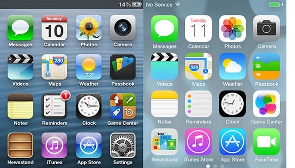
Backed by Y2K design influences, skeuomorphism peaked with Apple’s products between 2010 and 2015, but was also a major driving force for Microsoft’s OS such as Vista, 8, and earlier for Windows XP. Designers and developers toned down the use of skeuomorphism by only using 3D elements for program icons, leaving the background to a much clearer operational state and adopting a much neat desktop.
Through time icons became cooler with more details upgrading the visual style both for Microsoft and Apples products, and everyone at that time thought this design style would be the next big thing in terms of UI; however, it turned out to be a massive load of information for the user to digest and understanding which features can be interactive and which not. Spatial and element disorientation made it difficult for users understanding the interface layout.
But does it fly?
Skeuomorphism is aesthetically pleasing but places an excessive cognitive load upon the user, and some styles tend to be more detailed than others increasing the hardware and software requirements for the app to run, thus more energy translates in less battery life for the device and lower user expectations. Apple has always been a great fan of skeuomorphism and IOS 6 was peak design representation of realism for this style. It worked very well by impressing the audience when the iPhone was launched as users would interact way more often with these elements compared to their laptop or Macintosh.
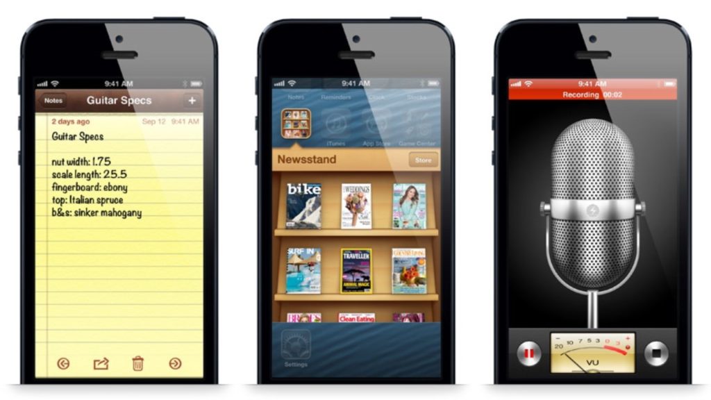
Because we’ve been using our smartphones more often than previously thought, Apple understood they were visually punishing their users with an excessive amount of details for each app. Notes app, Newsstand app, Voice Memo app, they all featured high elements of realism to stand out from their competitor and wow the user. Skeuomorphism is detailed with elements to enhance the high fidelity of real life objects, but here comes how the aesthetic portion will affect the usability of the product confusing the user over what it’s possible to use and what’s not.
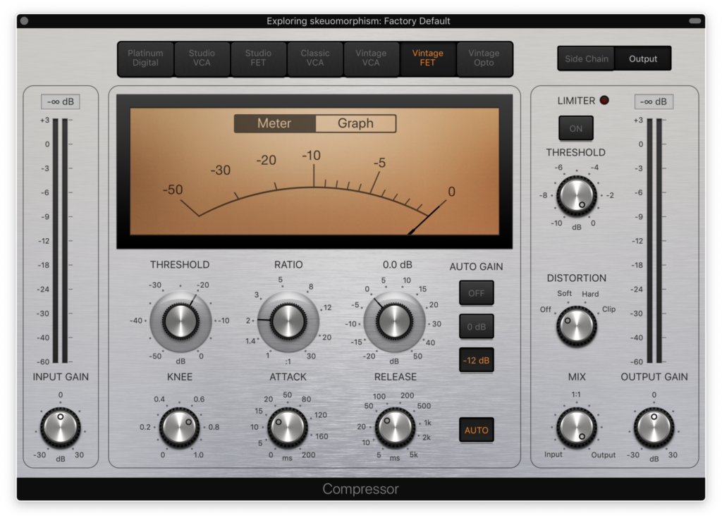
Yes, skeuomorphism is nice in small doses and might work well within specific apps that require a certain degree of realism in their UI. Music software is a great example because the depiction of physical equipment connects right well with users: an amplifier, a guitar pedal, a mixer. They’re all technologies that are still used today existing in parallel with their digital version, and they also tend to change very little through time compared to other mediums.
Do we really need this type of realism between the analogical and the digital world?
I don’t think we do as much as we needed in the past as today’s users are more trained and prepared to understand software elements. Yesterday’s skeuomorphism wasn’t just a pretty aesthetic feature but rather a teaching element helping users recognize their tools in a faster way. A yellow paper with rows of lines immediately pushes the user to think about a notepad, a shiny metallic gear represents the setup icon to make changes to the device, and so forth.
Replicating the plastic keys of a computer keyboards to be tapped on a touchscreen was Apple’s idea to reduce the onboarding process from those who used physical pads, for example Blackberry users, making a statement about their products by pushing for a full digital experience.
However, skeuomorphism with its elements has the power to saturate the eyes faster than a simpler UI approach, and that’s why over the last ten years a rise in popularity of minimalist design was protagonist in the markets. Simpler is better because it plays easy on the cognitive load, especially since we use our smartphone as a tool for multiple purposes for hours at the time on a daily basis.
Can skeuomorphism exist outside its environment?
Realism and 3D elements are characteristics of skeuomorphism and are visually recognizable from the start. The high details levels and sense of aesthetic is a peculiar leverage standing out from the rest, this will set this style apart from the rest, meaning skeuomorphism is bound to its essence and will clash if paired with other interface models.
Skeuomorphism comes in other flavors and is a strong ingredient in videogames because it represents the optimal intersecting point between realism and 3D. The user perceives a direct connection with this design as different elements bridge the two sides, and this choice of style enhances the experience of the player not just in the dynamic game play session but also with static ones.
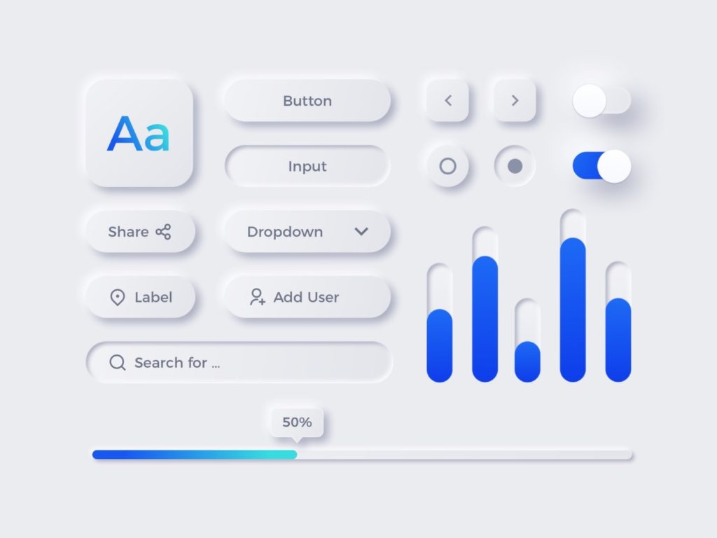
A new trend has seen a soft return of skeuomorphism under the name of neumorphism where there’s a mix of 3D elements in a clear environment of distinct design style. Personally, I think it’s a good modern option to consider if flat design is fading out, but not all software can benefit from an aesthetic change as the UX behind is the main mechanism for the purpose and functionality of the product.
Skeuomorphism and logos
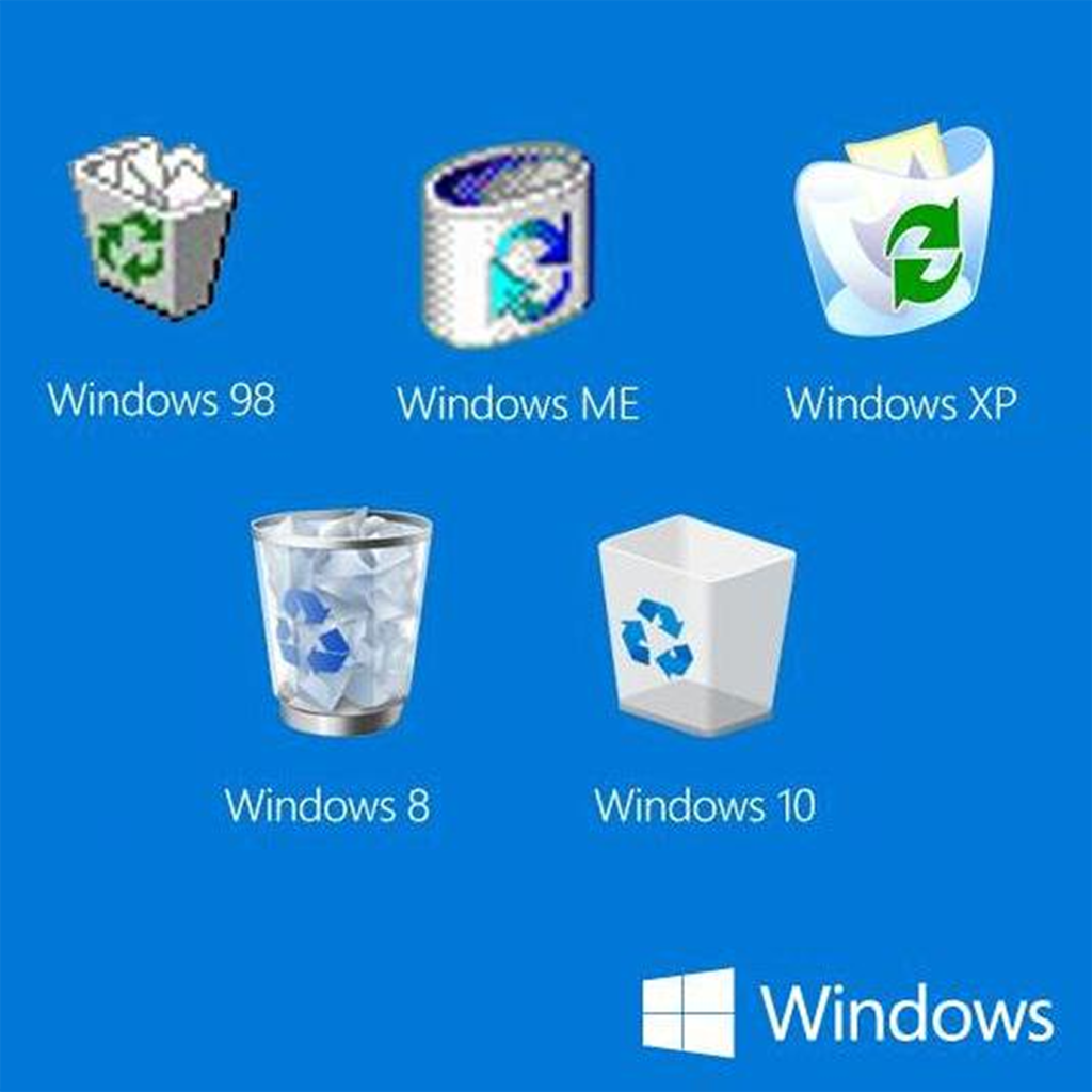
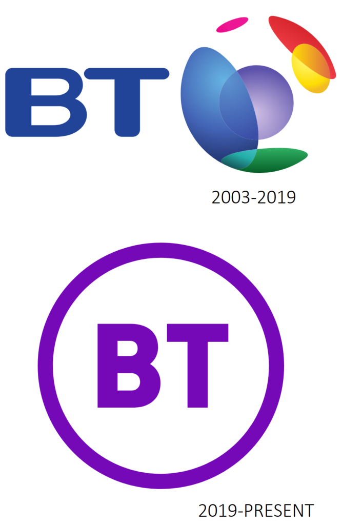
With the late changes in design trends, many brands opted to abandon skeuomorphism to adopt a minimalist approach to refresh their status quo. It’s the case of web browser Firefox by Mozilla that evolved from higher details and an aim to realism to a logo representing a fox wrapping a globe, where for every reiteration the details have been removed.
As time goes by the skeuomorphism phenomena lost its appeal with designer seeking more essential shapes and contrasts rather than an overabundance of visual stimuli. The race for simple and cleaner logo began across multiple industries, affecting a domino effect from other companies.
Skeuomorphism placed a great emphasis over the last thirty years in UI and graphic design, so much that it prompted the industry in opting to flat design choices. As we live in a minimalist design era where we abandoned textures, details, complex patterns, to decor our homes and cities, and with the fact sleek and smooth design seems to be the latest trending choice. I wouldn’t be surprised if skeuomorphism comes back to provide a physical connection with products and services, maybe as an antidote to the abstract gesture and interactions our devices are being developed with.
In essence, skeuomorphism is a cool highly packed and detailed design that wants to mimic real life elements with the intent to provide a unique experience for the user, but that at the same time loses practicality making it a poor UX choice especially for today’s technology where everything it condensed on smaller and portable screen devices.
Happy prototyping!