Categories
Product Design User Experience User Interface

Y2K design

This is part two of a three-post series on graphic aesthetics phenomena of the last decades in computer and interface design. You can find the first post here discussing skeuomorphism and its affect across software and devices.

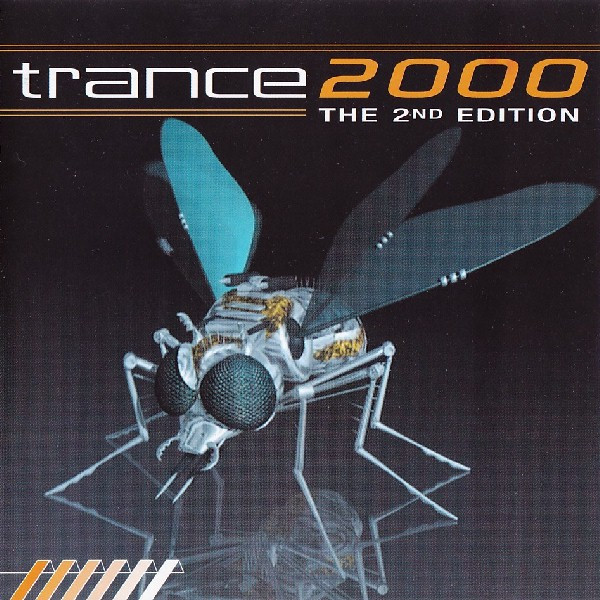
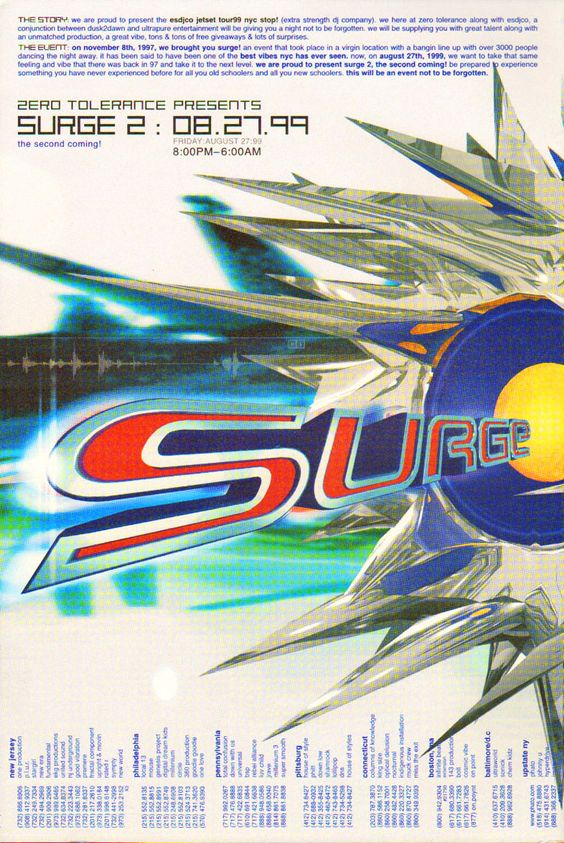
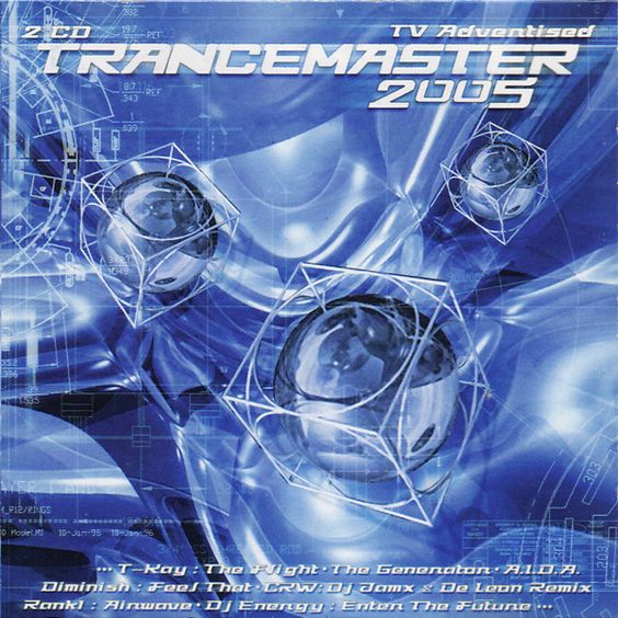
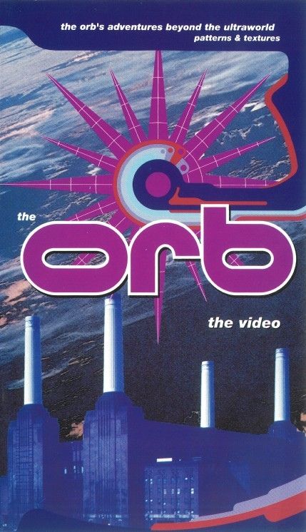
Y2K design is that set of visual elements that slowly in the first half the 90s condensed into a vision of end-of-century aesthetics. Its main theme is characterized by 3D graphics, saturated colors, geometries, transparencies, artificial elements, and futuristic themes.

In this context the main theme is “Global” as the markets across continents opened to the world-trading influencing each other. Global Village is the buzzword explaining how distances are slowly reduced by the ability to connect people via telecommunications. This is where design becomes not just a pretty element, but a business statement without being limited by economical restrains.

The graphic design

Poster featuring 3d elements were key to revolutionize 90s graphic design.

In previous decades we witnessed flat design styles in logo making and in illustrations, contrast to how the 90s were all about 3D with computer graphics becoming the norm in business, entertainment, and home use. People could create on their very own computer simple but stunning 3D elements with software like 3D Studio Max, using this design and implement them with other apps like Corel Draw or Photoshop to make cool prints and digital content.

Cold geometries, waves, chromatic scales, metal shapes, transparent plastics, were part of the essence of the design Y2K expression, it was a synonym of the ever increasing relationship society had with technology and how beyond the year 2000 we would eventually become. Transparent materials are often seen in products and interior design to show the mechanical complexity behind the surface, natural elements are abandoned moving towards the artificial.

Objects and abstract elements blended into a 3D soup of experimentation.

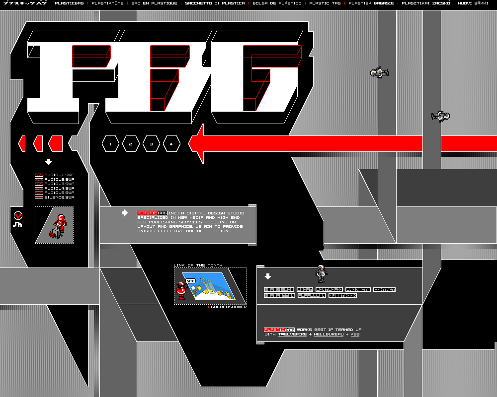
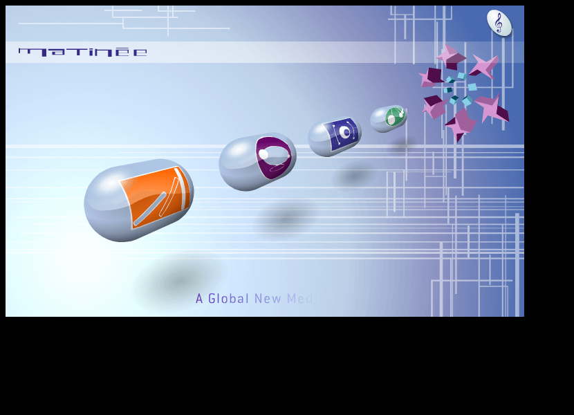
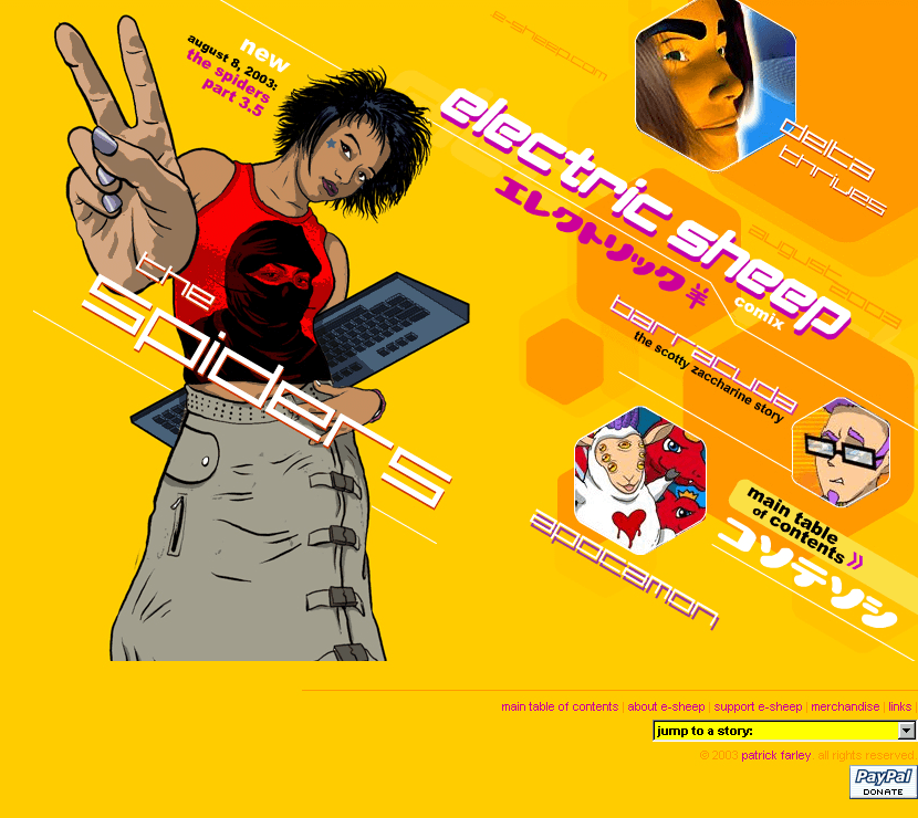
Web design is in this period a hot industry with internet available to the world having the opportunity for companies to interface to the public via aesthetically pleasing websites. The UX here is limited to the basic navigation layout and the technical constraints of the Web 1.0, while UI is king here becoming a way to communicate through a strong presence of color contrasts and abstract geometries.

90s/00s home pages were so cool [Source: web design museum].

Products for the masses

As we moved onto the mid of the 90s with the commercial availability of internet, people at home began to surf the web opening a whole new dimension of content consumption, later turned into content making as the main essence of the Web 2.0.

Tech consumer products in this period have begun shrinking in size and become widely available across countries with electronic stores expanding their presence promoting stereos, computers, cameras, CD players, VHS players, and other amenities that once were a niche market.

Japan was a driving force in consumer products.

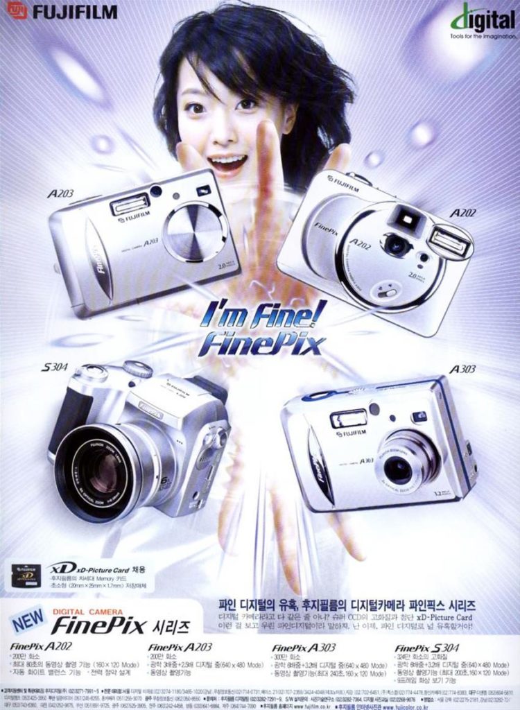
Designers working at large brands focused on developing goods with a specific futuristic aesthetic often represented by the silver and gray colors. Japanese companies like Fuji were major players in promoting Y2K design goods being well ahead of countries in the West.

I was a teenager when I started to get more and more interested into the design and the technology behind this new wave of consumer products. From 1995 to 2000 I regularly attended tech fairs and exhibitions venue in Milan, and there I started to notice a constant progression of quality and quantity across several gadgets, where the user could choose from the best brands such as Panasonic, Phillips, LG, Sony, Olivetti, Apple, IBM.

The Minidisc was apex coolness of portable devices.

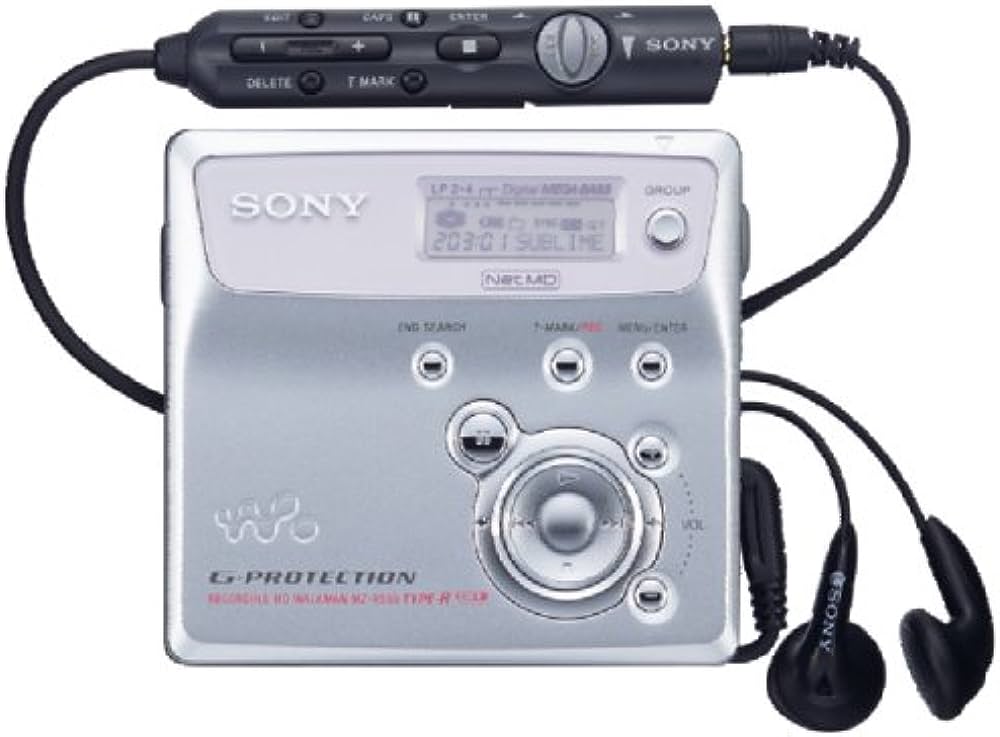
It was between 1996 and 1997 the Minidisc entered my orbit and it was love at first sight. This piece of marvel was the sequel of the Sony Walkman, developed to smash the audio cassette and the CD from the markets; its purpose was to represent the latest music portability and high-fidelity. Unlike the affordable magnetic technology of portable tape players, the MD electronic wasn’t cheap to produce and to market, it required a sophisticated understanding of hi-fidelity products the majority of consumers in the West weren’t yet ready for.

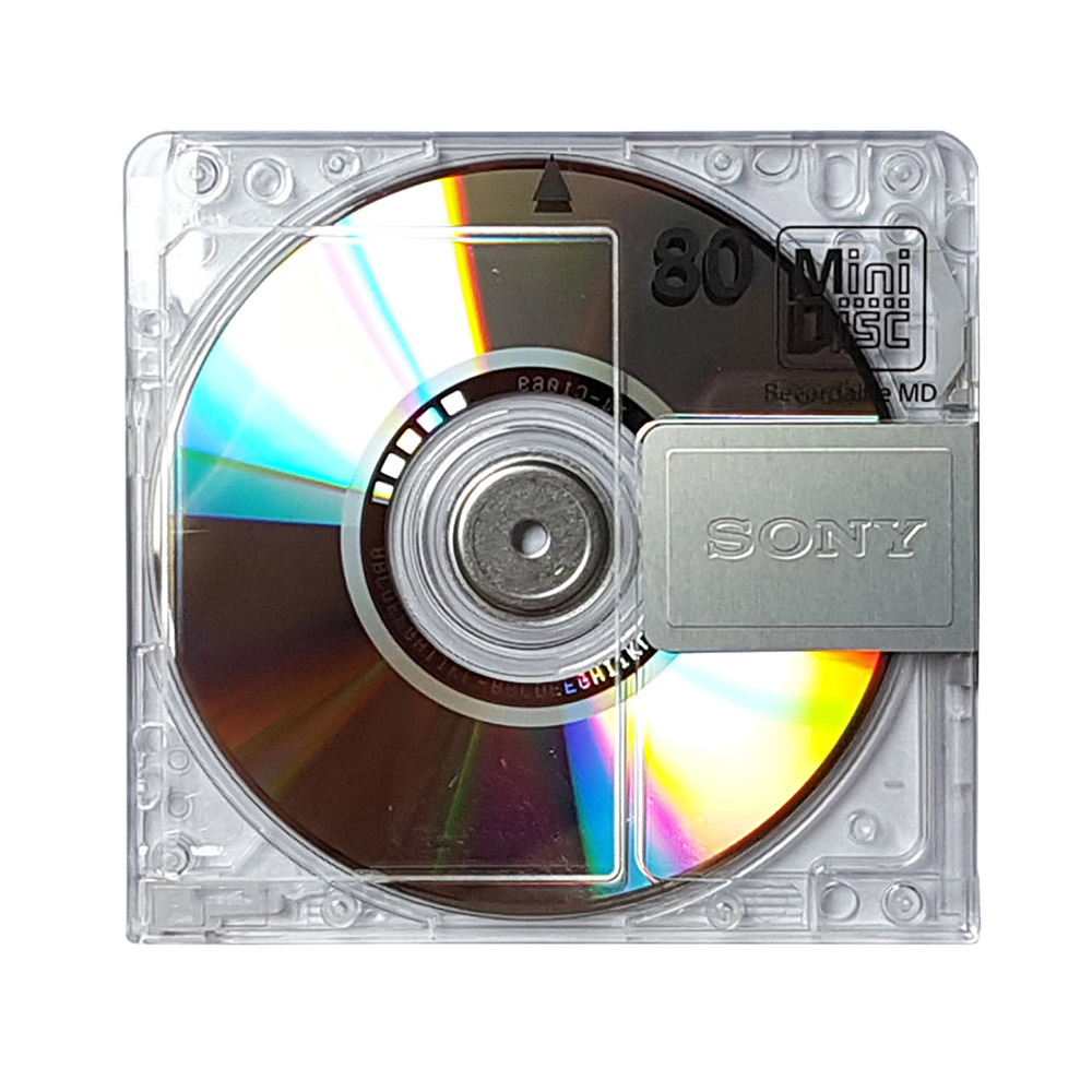
Despite being an overwhelming success in Japan, the Minidisc suffered from essential flaws outside of its native markets. Because Japan always strove to stay ahead of the competition in the electronic industry, the other western markets lagged behind and were still distributing and selling old music and storage format through CD, CD-rom, floppy disks. There wasn’t enough hardware request across Europe and North America to be able to host a major switch in favor of the Minidisc. This translated into high price tags at retail stores selling MD players for hundreds of dollars, making it an expensive purchase outside the reach of many consumers and being replaced at the beginning of the 2000s by the MP3 player at lower costs.

Mr. Anderson stored all his white rabbit’s adventures inside Minidiscs. And you?

Tech companies of the 90s developed the idea how the consumer should be at the center of everything, having the possibility to listen music, talk, recording images and videos, in order to be their own producers. This is where the ‘age of self’ begins placing on a global map the user with its experience.

With the return of Steve Jobs at Apple the company bounced onto Y2K to rebrand itself. A whole new line of products took place in the consumer market by officially putting Cupertino back on the radar.

Apple took Y2K and made it their own flagship design beyond the 90s.

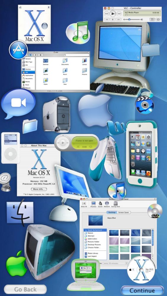
Take for instance the Macintosh with its transparent components as a driving force for Apple with such peculiar design, it was a statement of aesthetic to set themselves apart from the rest of the consumer product markets that were virtually indistinguishable from one another. Apple in the second half of the 90s became a wide available niche entity despite lagging behind Microsoft.

Remember to clean the poo.

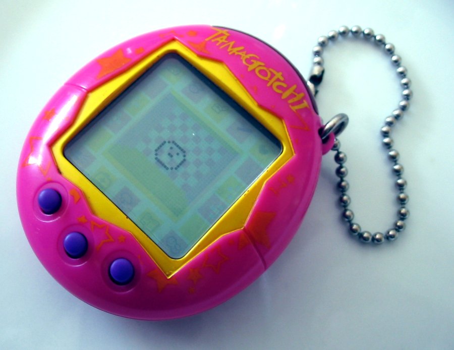
Products also came in a new variety to entertain the masses, one of the strangest one was in the shape of an egg where you are responsible for a virtual pet’s life by feeding it and making sure of its happiness. Tamagotchi was weird but awesome at the same time because it provided a new user experience that would last weeks or months, not just a quick escape but a play-behavior unseen until then.

The leap forward:
video games

In the videogame industry the Y2K design was a major driving force. Sony launched the Playstation in 1994 rocking the markets. The console was a big catalyst for game developers in crafting new titles that often were influenced by the Y2K effect, further amplifying this phenomena into the mainstream.

The Y2K level for this title is over 9000.

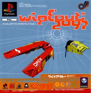
Games like Wipeout 2097 for Playstation represented the apex of Y2K style fully embracing its aesthetic and philosophy with their cool graphic elements and gameplay. Published in October 1996, this title was well received scoring high across gaming magazines and users.

Playstation was the golden goose for Sony.

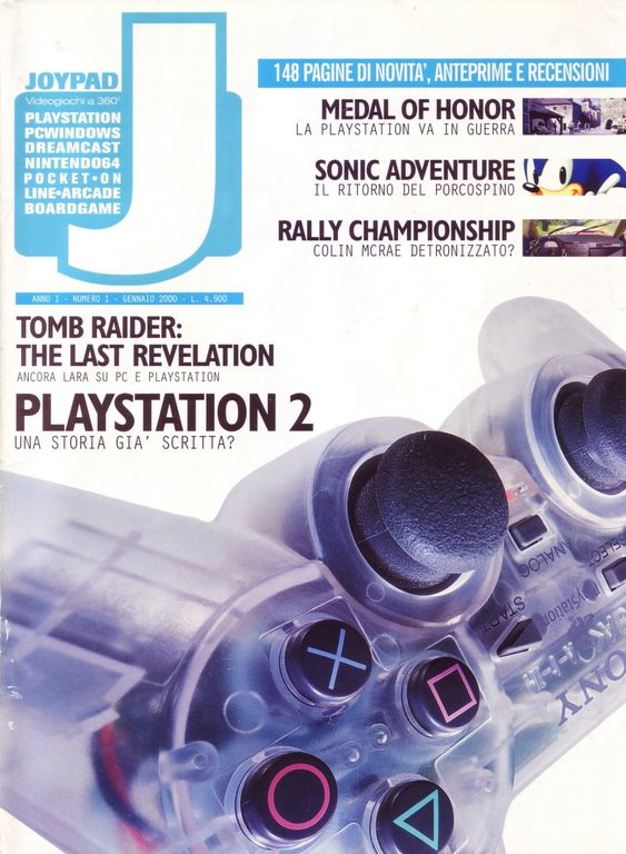
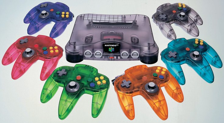
Nintendo played its cards quite well with the N64 and its Y2K variants successfully publishing a series of Super Mario 64 titles as well with the iconic 007:Golden Eye. Console developers were aggressively pushing for their complementary hardware sales in the form of cool controllers or other gadgets.

Transparent meant an added value to consumer products as a limited edition.

Console memory cards were essential for the household mental health…

The music and the Winamp era

This is the period where computers are becoming staple appliances in household across the globe, and with an internet connection users started to have access to new digital products and learn about the latest trends. Here computers started to become the serious alternative to television, not just machines to use once in a while, but an entertainment system too where all the family can benefit from it.

Sweet memories of sweeter times.

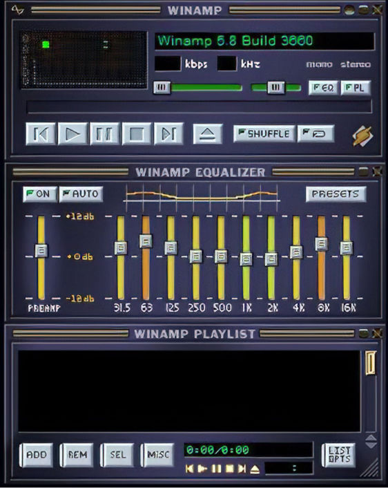
Y2K also means Winamp, a very popular music software that worked as a virtual digital stereo on your computer, there you could organize in various playlist all your Mp3 files and customize your layout selecting different skins. Back then, constantly changing skins was the wow factor that helped this software to become legend.

Winamp is one of the most successful digital products to have empowered user to manage their files and software customization. Even if Windows Media Players was a standard app in each Win98, 2000, XP, users would ditch it and immediately download and install Winamp for its flexibility, ease of use, cool factor.

The many skins of Winamp [Source: y2kaestheticinstitute.tumblr.com]

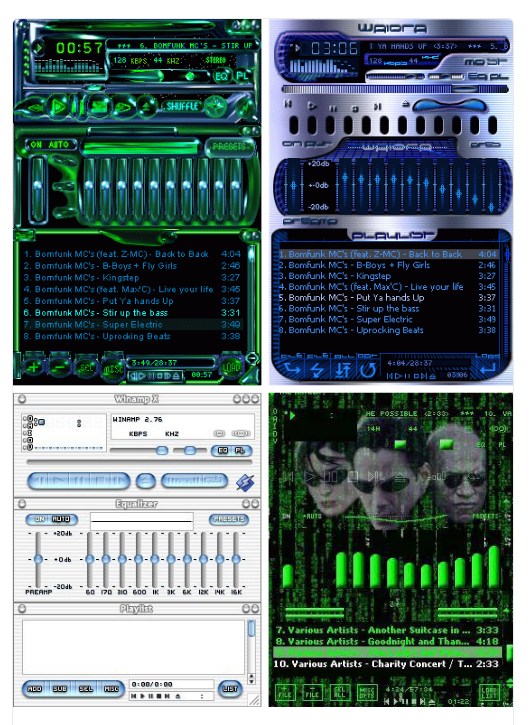
This product was a clear example of the change of times while approaching Y2K with all the commotion that was taking place. Winamp, developed by the defunct Nullsoft, showed the web how great products had the ability to be crafted by a dedicated user base rather than coming from AAA companies. An important step of the democratization process of the web beginning in that period.

The ability to have an entire folder in your computer with hundreds of songs scared radios and record producers, but we didn’t care and carried on empowering ourselves s through our desktops. We wanted to connect with the rest of the world and the web was the right instrument to influence society. It was a great time of digital discoveries.

Aphex Twin’s distinguishable logo.

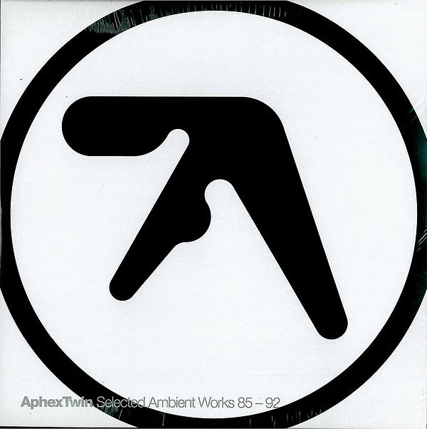
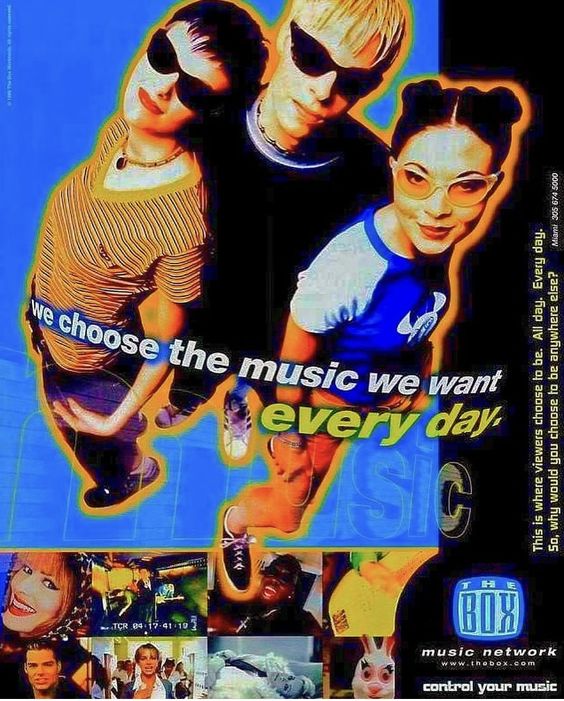
Various artists contributed to the Y2K aesthetic between the 90s and early 2000 with truly amazing art pieces featured on their album covers. Aphex Twin, Radiohead, Prodigy, and Massive Attack. This is the age of experimental music and wide distribution across TV networks, but also the development of underground music scenes becoming popular like electronic music.

POP by U2 was an iconic and visually interesting album.

U2’s album POP was a condenser of those years fueled by intensive consumerism and ego perfectly narrated through the each track. The term ‘Pop’ was a recurrent trend in the West taken from the 50s/60s period of iconic creativity made famous by Pop Art with names like Andy Warhol turning painting into advertising and viceversa.

Ok computer.

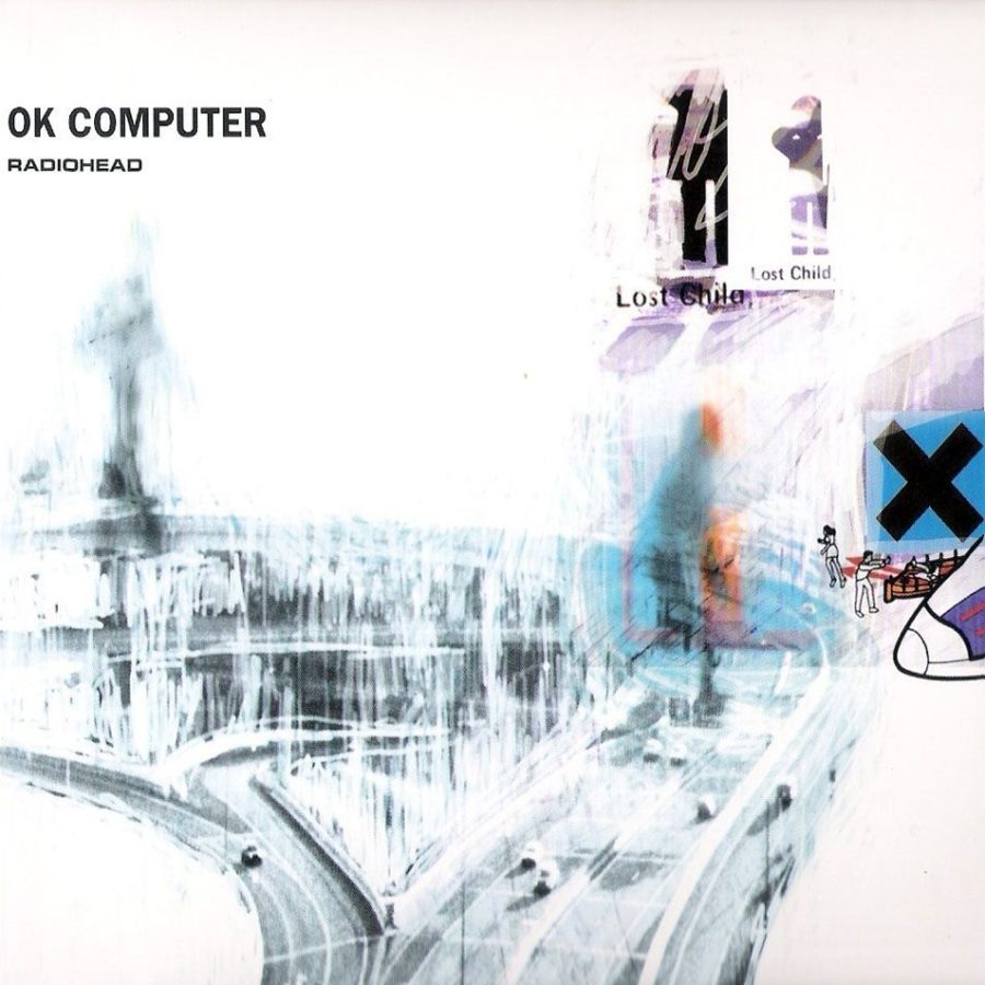
Radiohead are flying high thanks to their 1997 album Ok Computer confirming the electronic sound as the main component for this period of time, becoming the official vibe of the Y2K period jading an entire generation of Millennials.

Interior design

Transparency, transparency everywhere.

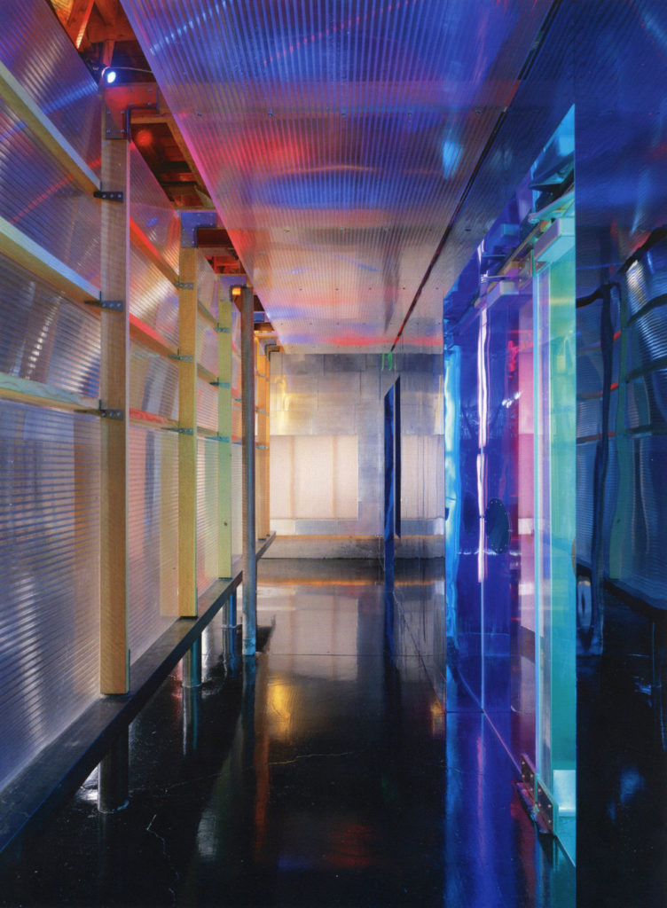
Y2K interior design was achievable thanks to new materials and their applications. This period ot time wanted to encompass the use of both artificial and natural elements melding metals, plastics, and wood.

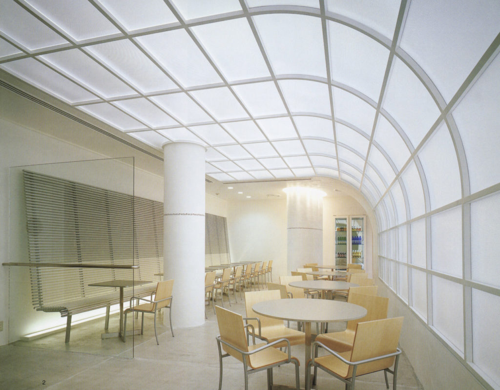
The cool vibes of the 80s neon lights were slowly fading away to be replaced with surface reflections and natural lights. This is the time frame where designers and architects come together to reshape public spaces and the workspace. Materials and their characteristics are protagonist creating the desired indoor effects.

Indoor industrialism as the cool factor.

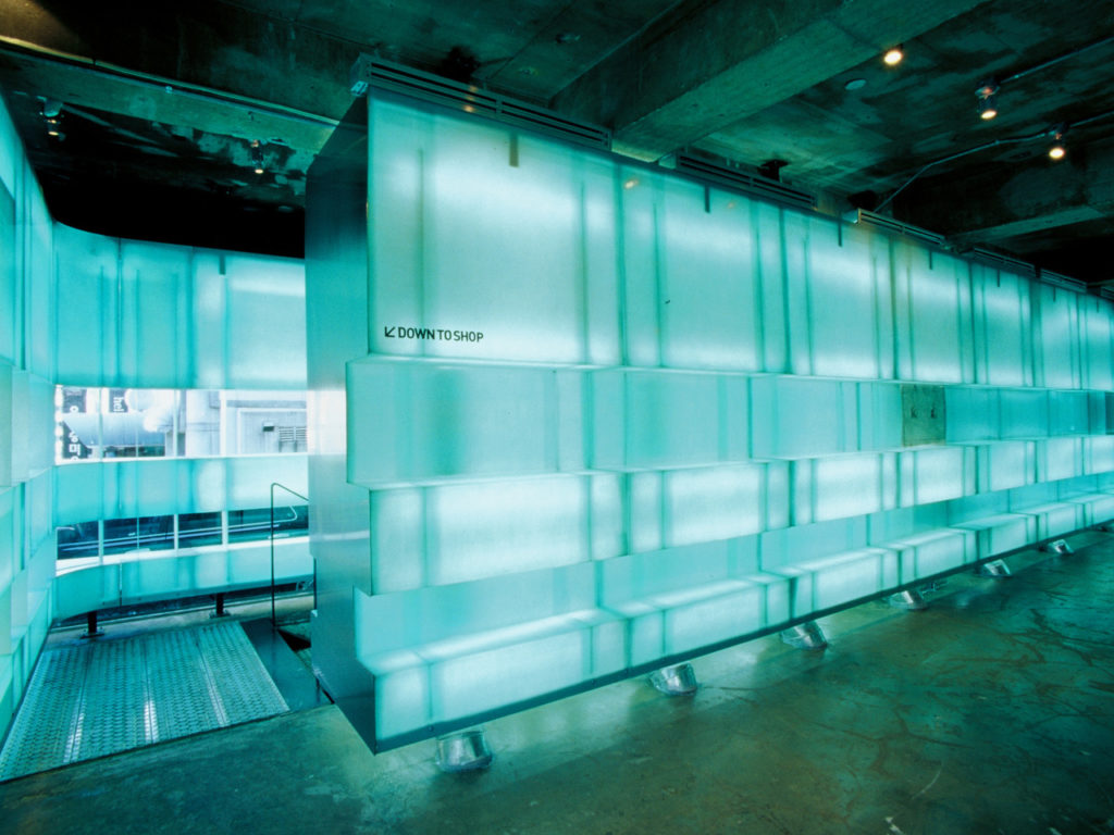
Another essential characteristic of this design is the popular choice of minimalist geometries often influenced by cyberpunk elements. Back then the consensus was how society and cities were going to resemble utopia movie sets as we departed humanism, leaving it behind to the past and embracing a cybernetic tomorrow.

Oxford St. London’s McDonald’s [Source: y2kaestheticinstitute on Tumblr]

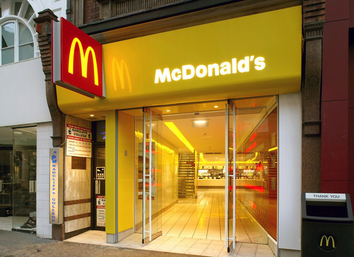
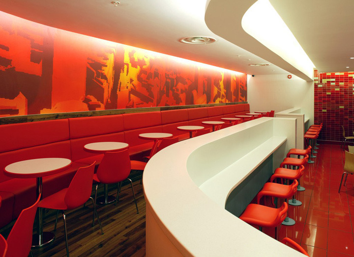
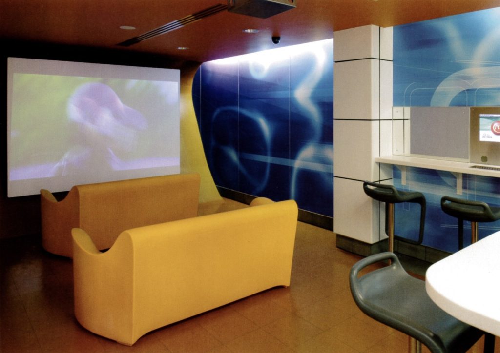
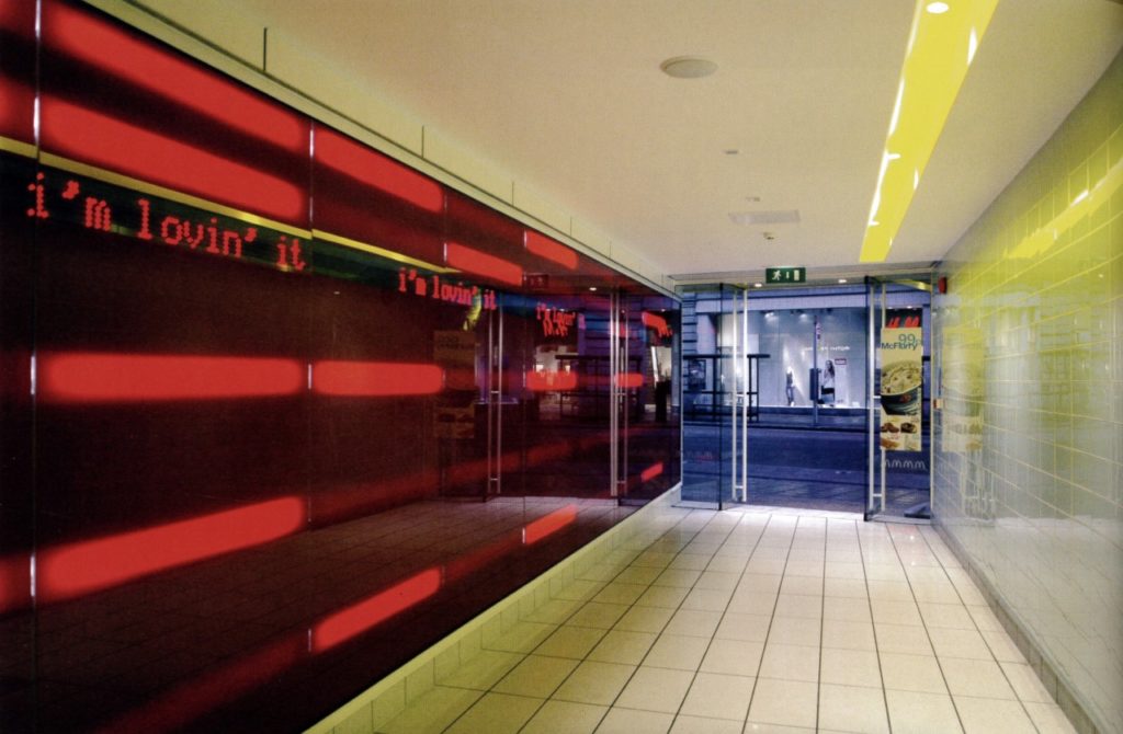
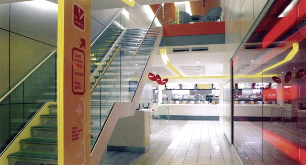
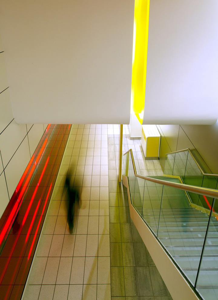
This particular McDonald’s in London was a spearhead in interior design proposal and execution, it worked really well in commercial spaces offering a sleek and spacious volume for customers to navigate. Y2K interior design predicates practical efficiency as a reminiscence of the Bauhaus style removing decorative elements. Although cool and practical it’s a challenge to the human brain as it seeks complex patterns and natural shapes to be stimulated.

Fashion

Aesthetic plays a major role in the Y2K fashion. [Source: Snug Industries].

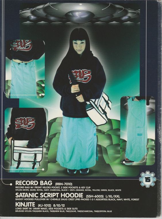
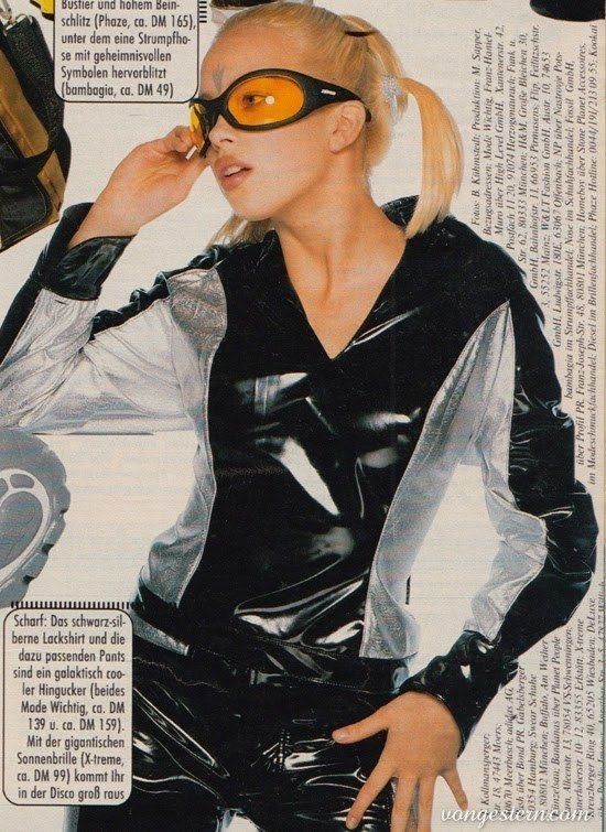
Y2K fashion was about departing from the traditional makings of the past. Here we move away from the materials that have been with us for centuries: cotton, wool, linen, being replaced with acrylics, nylons, plastics, metals. Fashion made by synthetic components wasn’t just an artistic statement, it was an industry strategy to produce entire new lines of clothing for a cheaper production but with a high profit yield.

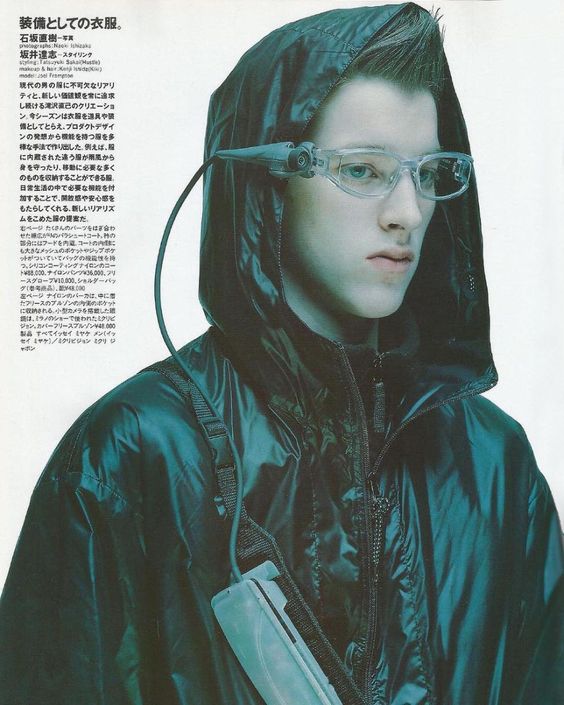
As tech products became smaller and smaller, fashion designers started to incorporate them into our daily life often believing clothing and gadgets would eventually become one entity; wearing technology was the expected and wild trend at the same time, but an accurate prediction nonetheless.

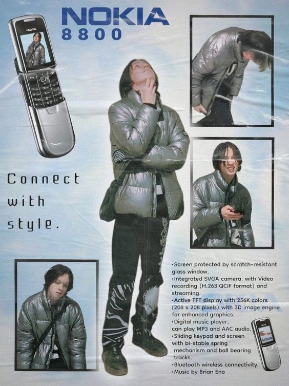
Nokia was a very important brand and influence in this period, their cellphone quality and reliability were a high standard on the market. Their products followed the Y2K design principles featuring silver colors promoting them as a fashion statement.

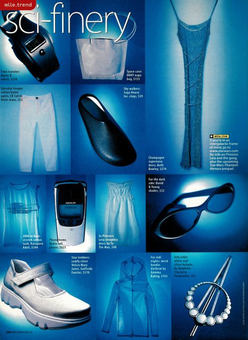
Other colors such as blue, gray, black, white, were used to highlight the feeling of coldness and industrialism. Patterns were removed and sleek shapes and surfaces are the norm across the Y2K design spectrum. I can’t deny how these fashion elements are inspired by the wild imagination of TV and movie productions, especially if we take into consideration examples like Blade Runner with its costumes and props.

Movies

The iconic representation of symbiosis between man and machine.

Great expectations are always placed upon movie productions to craft great narratives to inspire the viewers. It’s the case of the 1999 movie The Matrix with its spectacular vision of a modern society overwhelmed by the use of technology, with its destiny forged by machines in an attempt to fight them and survive searching for their lost humanity.

The Matrix accentuates the conflict of relying for far too long on machines by using them not as a tool but as a mean. In this context the approach of the new millennium is opening a new century of technological marvels, often forgetting how humans are still socially and psychologically evolving, and where an impact of sudden changes might bring more questions than solutions.

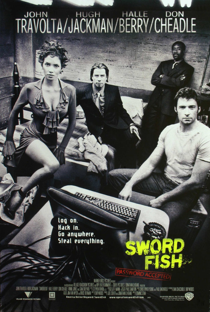
The Y2K vibe is also fueled by the extensive influence of computers and the power of the web. Hackers and hacking started to become two words often misused to produce entertainment, but movies can’t resist trends and buzzwords so they would jump ship and pay John Travolta to star in Swordfish.

Do not confuse it with the swordfish, the fish.

Hackers was a daring but entertaining project aiming to connect with young crowds by exploiting the current phenomena of computer hacking, something the press started finding amusing by publish more and more but without grasping its true concept.

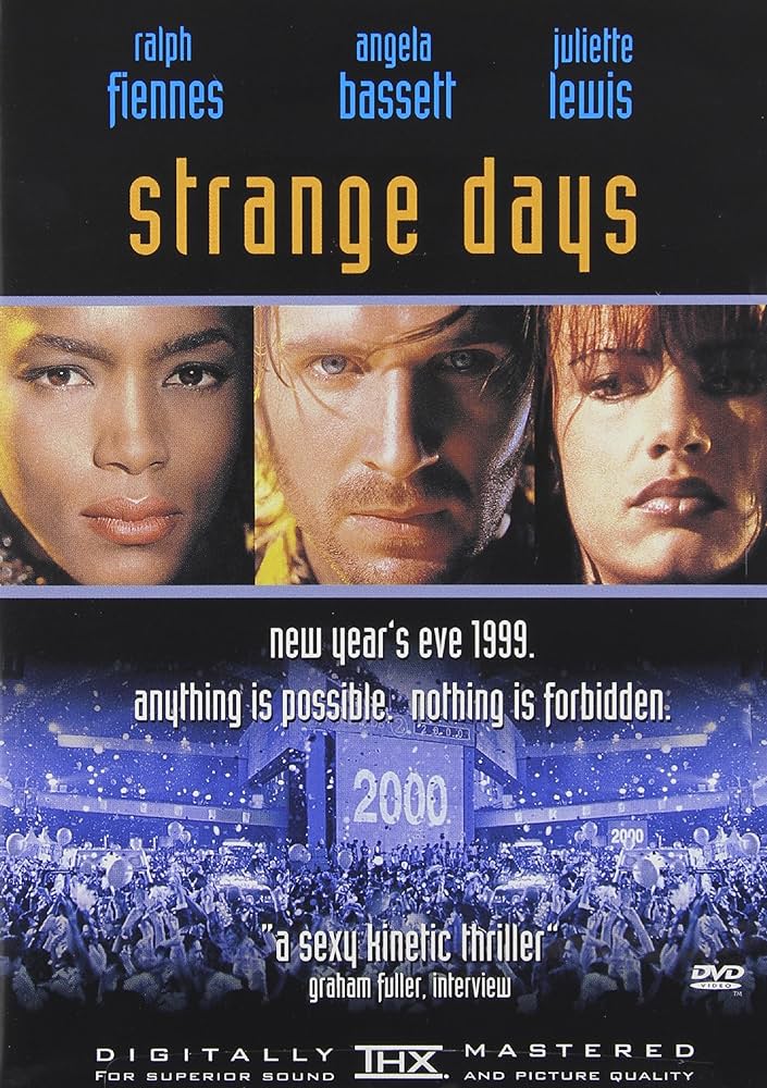
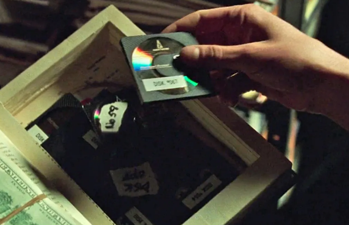
I thought about Johnny Mnemonic but the movie is a full plunging into cyberpunk with its dystopian twists and deserves a post of its own despite possessing several Y2K elements; Strange Days uses the same concept of hacking the brain as the ultimate tool to go beyond reality and the human limits. In this creative work frame projections and dreams are encapsulated into their technological capability to be reproduced, much like a painting or a play can be recorder and viewed through out electronic capabilities.

Last stop

Y2K has multiple elements ad genre that go well beyond what we described here. It was a period of time where technology and its lure pulled us into this synergy of extended futurism and consumerism. Y2K design was characterized by the vision of tomorrow that brands and creators envisioned over 25 years ago.

Personally, I’ve always enjoyed Japan’s vision of Y2K for its capability to propose on multiple levels a whole new foresight of creativity and innovation. Consumer products, entertainment, fashion, wanted to distinguish themselves from the past decades by promoting the ‘synthetic’ as a pivoting platform for new proposals.

Y2K design will forever be remembered as the essential aesthetic and functional phenomena that condensed multiple characteristic. It wasn’t just a visual experience but a way of entering the future we are living today.

Happy wireframing!

Categories
Brands Product Design Psychology User Experience User Interface

A look back at skeuomorphism

Skeuomorphism is a term used in technology to describe digital elements that replicate real life objects to enhance their purpose and visual characteristics generating a specific aesthetic. There have been plenty of applications in the past thirty years that opted to replicate something we see on a daily basis, and despite being visually pleasing it’s not the best choice for interfaces.

This design applies to software that pioneered its UX and UI essence to stand out from bland element shapes and colors, gaining popularity through 1990s as software developers believed digital interfaces should imitate real life environments to facilitate the user. Some used skeuomorphism to build interfaces with the intent of standing out from the rest of the competitors, others just went along the trend and often created unpleasant design experiences.

Microsoft’s BOB in 1995 wanted to be the main interface for Windows.

Skeuomorphism and 3D

The purpose of skeuomorphism is to facilitate the user by creating 3D or realistic user interface elements with the purpose to stand out, reproducing a familiar environment, and to be clearly visible by different experience. However, the abundance of elements in the UI doesn’t help understanding how we can clearly accomplish our tasks.

Backed by Y2K design influences, skeuomorphism peaked with Apple’s products between 2010 and 2015, but was also a major driving force for Microsoft’s OS such as Vista, 8, and earlier for Windows XP. Designers and developers toned down the use of skeuomorphism by only using 3D elements for program icons, leaving the background to a much clearer operational state and adopting a much neat desktop.

Through time icons became cooler with more details upgrading the visual style both for Microsoft and Apples products, and everyone at that time thought this design style would be the next big thing in terms of UI; however, it turned out to be a massive load of information for the user to digest and understanding which features can be interactive and which not. Spatial and element disorientation made it difficult for users understanding the interface layout.

Even the trash bin got cooler through the years.

But does it fly?

Skeuomorphism is aesthetically pleasing but places an excessive cognitive load upon the user, and some styles tend to be more detailed than others increasing the hardware and software requirements for the app to run, thus more energy translates in less battery life for the device and lower user expectations. Apple has always been a great fan of skeuomorphism and IOS 6 was peak design representation of realism for this style. It worked very well by impressing the audience when the iPhone was launched as users would interact way more often with these elements compared to their laptop or Macintosh.

Good looking but it’s distracting.

Because we’ve been using our smartphones more often than previously thought, Apple understood they were visually punishing their users with an excessive amount of details for each app. Notes app, Newsstand app, Voice Memo app, they all featured high elements of realism to stand out from their competitor and wow the user. Skeuomorphism is detailed with elements to enhance the high fidelity of real life objects, but here comes how the aesthetic portion will affect the usability of the product confusing the user over what it’s possible to use and what’s not.

Yes, skeuomorphism is nice in small doses and might work well within specific apps that require a certain degree of realism in their UI. Music software is a great example because the depiction of physical equipment connects right well with users: an amplifier, a guitar pedal, a mixer. They’re all technologies that are still used today existing in parallel with their digital version, and they also tend to change very little through time compared to other mediums.

Which features can you interact with and which one are just aesthetic?

Do we really need this type of realism between the analogical and the digital world?

I don’t think we do as much as we needed in the past as today’s users are more trained and prepared to understand software elements. Yesterday’s skeuomorphism wasn’t just a pretty aesthetic feature but rather a teaching element helping users recognize their tools in a faster way. A yellow paper with rows of lines immediately pushes the user to think about a notepad, a shiny metallic gear represents the setup icon to make changes to the device, and so forth.

Replicating the plastic keys of a computer keyboards to be tapped on a touchscreen was Apple’s idea to reduce the onboarding process from those who used physical pads, for example Blackberry users, making a statement about their products by pushing for a full digital experience.

IOS toned down the realism to provide more clarity.

However, skeuomorphism with its elements has the power to saturate the eyes faster than a simpler UI approach, and that’s why over the last ten years a rise in popularity of minimalist design was protagonist in the markets. Simpler is better because it plays easy on the cognitive load, especially since we use our smartphone as a tool for multiple purposes for hours at the time on a daily basis.

Can skeuomorphism exist outside its environment?

Realism and 3D elements are characteristics of skeuomorphism and are visually recognizable from the start. The high details levels and sense of aesthetic is a peculiar leverage standing out from the rest, this will set this style apart from the rest, meaning skeuomorphism is bound to its essence and will clash if paired with other interface models.

Skeuomorphism comes in other flavors and is a strong ingredient in videogames because it represents the optimal intersecting point between realism and 3D. The user perceives a direct connection with this design as different elements bridge the two sides, and this choice of style enhances the experience of the player not just in the dynamic game play session but also with static ones.

Note the map details with the seal stamp on the bottom-left and the name of the printer on the bottom-right of the map. [Dishonored 2– 2016 Arkane Studios]

A new trend has seen a soft return of skeuomorphism under the name of neumorphism where there’s a mix of 3D elements in a clear environment of distinct design style. Personally, I think it’s a good modern option to consider if flat design is fading out, but not all software can benefit from an aesthetic change as the UX behind is the main mechanism for the purpose and functionality of the product.

Neumorphism is perhaps what skeuomorphism was intended in the first place.

Skeuomorphism and logos

With the late changes in design trends, many brands opted to abandon skeuomorphism to adopt a minimalist approach to refresh their status quo. It’s the case of web browser Firefox by Mozilla that evolved from higher details and an aim to realism to a logo representing a fox wrapping a globe, where for every reiteration the details have been removed.

A Firefox is actually a red panda, but it would be difficult not to think of a fox.

As time goes by the skeuomorphism phenomena lost its appeal with designer seeking more essential shapes and contrasts rather than an overabundance of visual stimuli. The race for simple and cleaner logo began across multiple industries, affecting a domino effect from other companies.

British Telecom went drastic in their logo change to a simple purple/white duo.

Skeuomorphism placed a great emphasis over the last thirty years in UI and graphic design, so much that it prompted the industry in opting to flat design choices. As we live in a minimalist design era where we abandoned textures, details, complex patterns, to decor our homes and cities, and with the fact sleek and smooth design seems to be the latest trending choice. I wouldn’t be surprised if skeuomorphism comes back to provide a physical connection with products and services, maybe as an antidote to the abstract gesture and interactions our devices are being developed with.

In essence, skeuomorphism is a cool highly packed and detailed design that wants to mimic real life elements with the intent to provide a unique experience for the user, but that at the same time loses practicality making it a poor UX choice especially for today’s technology where everything it condensed on smaller and portable screen devices.

Happy prototyping!

Categories
User Experience User Interface

Easy peasy

I typed “easy peasy” into generative AI and the image above is what I got, but it’s got nothing to do with this quick posting because I’d like to point out the obvious that yet is still in need to be addressed.

What’s this about, you’re asking? I’ve been using computers for 30+ years and there are still doubts over simple UX/UI rules in the industry; so let me start from this statement: design for your grandma.

Why should you design for your grandma? Many products end up in households where users have nothing to do and have no knowledge how their purchase was developed.

Imagine your grandma having to deal with the latest smartphone you decided to give her for Christmas to stay in touch. Your heart is in the right place and you believe the latest technologies can win obstacles and simplify things.

Wrong! You’re complicating the experience and alienating the user from the product and sophisticating even the smallest task such as making a phone calls. We’ve been there, just don’t again.

To develop successful products you need to start thinking as if the user if a 5-year old or a golden retriever. Start with small interactions and task achievements to build the basic functioning of your project. This needs to be addressed and in the future I’ll write a more extensive post.

But let’s think small and address the very basic communication gap that still persists in software development, mostly because companies delegate the whole process to software developers avoiding hiring product or ux designers leaving behind important researches and prototyping.

Yes, it can happen to you.

Alert and message boxes are essential to comunicate the user critical decisions to take that will affect the outcome of the task. Take a look at the pic above where the buttons to click are written in Japanese, now you can roll the dice and believe the left one is Ok and the right one is Cancel. No, because you don’t know if that Japanese text was written right-to-left in its traditional form or the other way around. Don’t gamble, run your UX tests before the commit.

Motherf…..!

Now, there are developers who really don’t care about you and there’s a special place in hell for them. The above message is quite important and yet it manages to confuse you, providing more doubt into the user’s mind and fogging up the decision making: what am I cancelling?

It’s that simple, yet…

Don’t complicate user’s life, make the task achievable in the shortest time possible without generating doubts. Software is created to simplify our work and developers ought to make it easy on decision-making. The question is simple and so should be the answer.

If I catch you doing this…

Yes and No is a binary selection over a positive question, but often we find more information inside of it that requires a choice in that action: this or that? Therefore we have to adjust the answer output to match the task request so the user can provide its preference.

Pay attention to the message.

However, some software present redundancy in user’s input becoming overzealous and taking too much time, especially if the app is slow because it has to access a remote database to complete its task. In that care lag is a killer but what can you do, impatient user will slam on the Yes button until they stumble on a bad request just like the picture above.

Clear options for clear actions

So, to avoid smashing the Yes button, we can provide engagement by asking the user to make a specific choice when there’s the need to take a specific action. The above image is asking “Do you want to exit the program or close the file?”, in this case the user wants to stop using the software and turn off the machine or it was a mistake. This feature is telling the user: “I know you want to quit, but are you telling me to shut down the software or you wanted to close this file and continue on something else?”.

You’re probably asking yourself:”But what if I want the third option and Cancel?”. Don’t add a third button called ‘Cancel’, instead allow the user to click the X button located at the top-right corner, it’s universally acknowledged how that function works, meaning: close the message box and continue working, but most likely you haven’t saved your work and unless you have an auto-save feature, then press CTRL+S if you’re running Windows or COMMAND+S if you’re on a Mac.

In the end, easy-peasy wins the race reducing the onboarding process and avoiding the cognitive overload onto the user. Tasks shouldn’t be developed with excessive thinking, especially when we deal with a complex software that requires major resources and long hours from the user side.

Happy prototyping!

Categories
Foresight

The tech race for the next economy

The last four weeks gave us a sad panoramic of the bad preparation state western countries are living in. Despite the wide availability of technology we suddenly discovered this invisible wall affecting the healthcare sector, and no country in Europe or North America had the contingency to get ready for this pandemic.

We are not talking about the lack of expensive medical equipment, but the simple things like those face masks doctors are in dire need just to go by their simple tasks. Then we also seen the need for respirators so companies are scrambling to convert their production lines to meet the new demand. Virgin Orbit did so and surprisingly we can see a simple and cheap mechanism that can help patients, yet too many hospitals are in short of.

While Apple already ventured into healthcare with user information being harvested via their devices, we will now see companies invest into the medical field with a great emphasis seeking new growth and new profits. This will be driven by a new demand for hospitals, universities, and labs, to acquire new personnel and students with an interest in immunology and infectious diseases. The great demand for vaccines, machineries, and AI, will propel the global economy to the Industry 4.0 moving away from older production practices and affecting the labor force

The tech race for the next economy will venture into more data-gathering and its elaboration to provide more accurate information. With the implementation of AI in the healthcare sector to improve cognition and analysis of medical data, we can expect significant investments in the digital realm influencing global markets to head towards that direction. This has the possibility to affect doctors’ behavior in delegating more responsibilities of diagnosis towards AI, thus changing this role into a more managerial function applied to direct nursing staff and other hospital personnel. However I wouldn’t exclude banks from entering the healthcare industry business with a heavy foot.

Another important field that will reshape production sectors are the 3D printing technologies applied for small and large scale projects. In March an Italian engineer managed to help patients in intensive care in northern Italy by printing in a few hours the much needed oxygen valves for the hospital. In case small hospitals should be built during emergencies we can rely on 3D concrete printing for fast solutions; using more printers in one site it’s possible to raise a safe and durable structure with better qualities than the traditional brick method.

These technologies are already here and have already delivered so much in recent years. Companies can access this tech realm without having to resort to big capitals to invest, this mean small enterprises can innovate their sector and themselves. This pandemic and consequential economic crisis will trigger this race for survival, pushing more into the digital world than ever before.