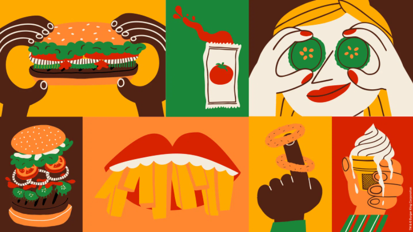
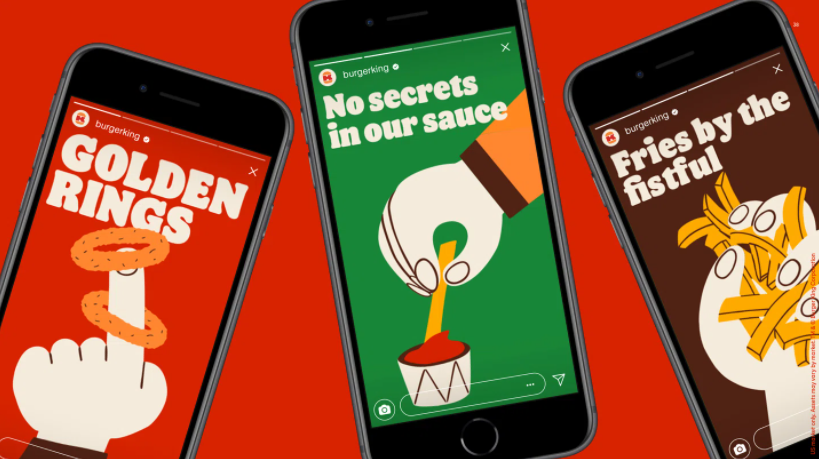
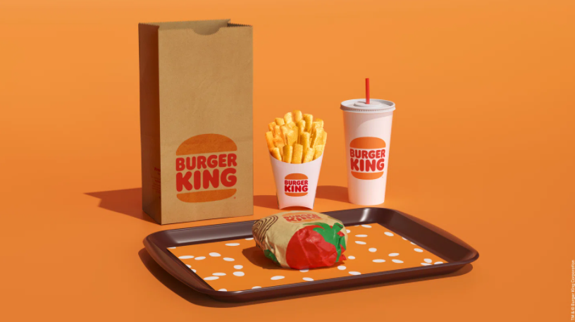
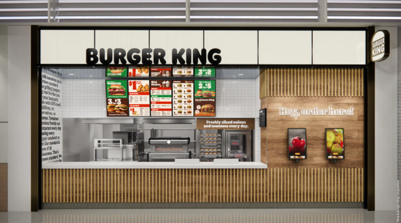
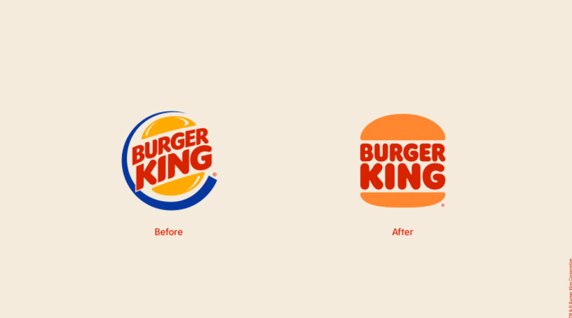
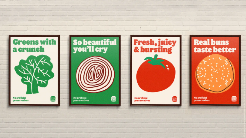
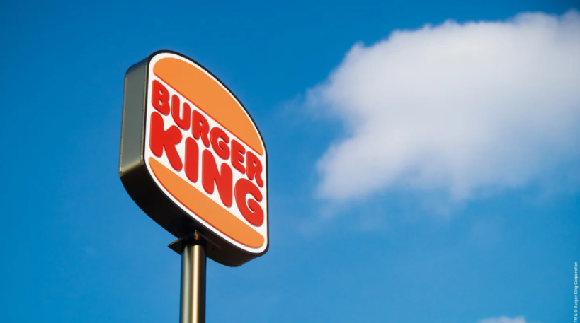
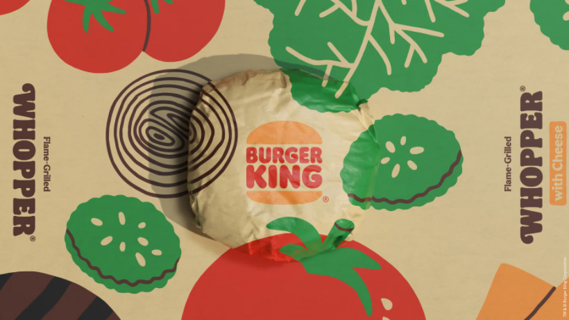
After 20 years Burger King gets a major facelift with some fresh and funky art, going back to a flat logo and getting inspired by the 60s vibe to renew their brand. Flat logos made a comeback after decades of shiny and glossy design mimicking the Y2K tech era, even Subway went on a time trip simplifying their aesthetic in order to rebrand themself. However, BK goes one step further by adding some nice graphic elements with their new color palette.