
I typed “easy peasy” into generative AI and the image above is what I got, but it’s got nothing to do with this quick posting because I’d like to point out the obvious that yet is still in need to be addressed.
What’s this about, you’re asking? I’ve been using computers for 30+ years and there are still doubts over simple UX/UI rules in the industry; so let me start from this statement: design for your grandma.
Why should you design for your grandma? Many products end up in households where users have nothing to do and have no knowledge how their purchase was developed.
Imagine your grandma having to deal with the latest smartphone you decided to give her for Christmas to stay in touch. Your heart is in the right place and you believe the latest technologies can win obstacles and simplify things.
Wrong! You’re complicating the experience and alienating the user from the product and sophisticating even the smallest task such as making a phone calls. We’ve been there, just don’t again.
To develop successful products you need to start thinking as if the user if a 5-year old or a golden retriever. Start with small interactions and task achievements to build the basic functioning of your project. This needs to be addressed and in the future I’ll write a more extensive post.
But let’s think small and address the very basic communication gap that still persists in software development, mostly because companies delegate the whole process to software developers avoiding hiring product or ux designers leaving behind important researches and prototyping.
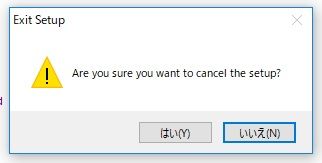
Alert and message boxes are essential to comunicate the user critical decisions to take that will affect the outcome of the task. Take a look at the pic above where the buttons to click are written in Japanese, now you can roll the dice and believe the left one is Ok and the right one is Cancel. No, because you don’t know if that Japanese text was written right-to-left in its traditional form or the other way around. Don’t gamble, run your UX tests before the commit.
Now, there are developers who really don’t care about you and there’s a special place in hell for them. The above message is quite important and yet it manages to confuse you, providing more doubt into the user’s mind and fogging up the decision making: what am I cancelling?
Don’t complicate user’s life, make the task achievable in the shortest time possible without generating doubts. Software is created to simplify our work and developers ought to make it easy on decision-making. The question is simple and so should be the answer.
Yes and No is a binary selection over a positive question, but often we find more information inside of it that requires a choice in that action: this or that? Therefore we have to adjust the answer output to match the task request so the user can provide its preference.
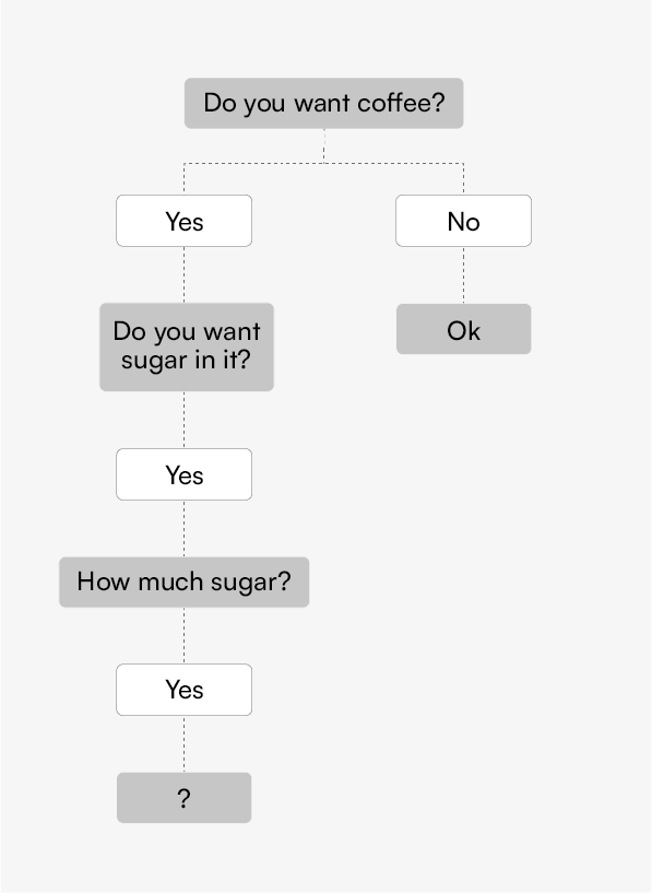
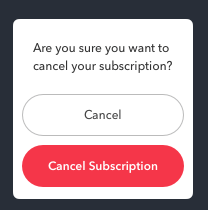
However, some software present redundancy in user’s input becoming overzealous and taking too much time, especially if the app is slow because it has to access a remote database to complete its task. In that care lag is a killer but what can you do, impatient user will slam on the Yes button until they stumble on a bad request just like the picture above.
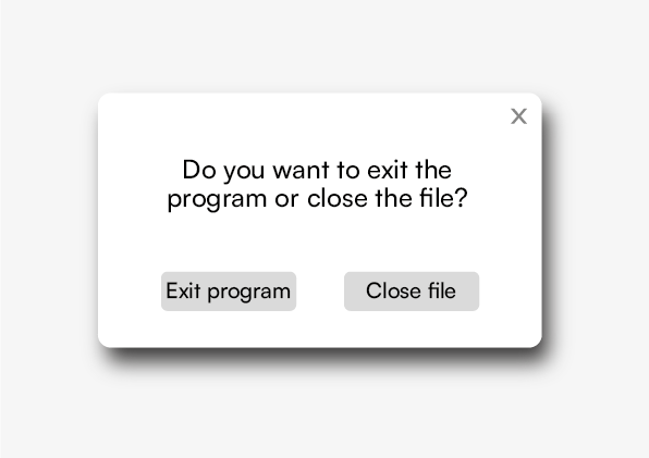
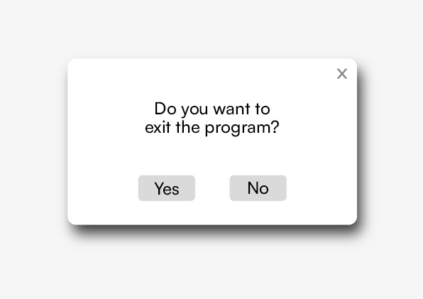
So, to avoid smashing the Yes button, we can provide engagement by asking the user to make a specific choice when there’s the need to take a specific action. The above image is asking “Do you want to exit the program or close the file?”, in this case the user wants to stop using the software and turn off the machine or it was a mistake. This feature is telling the user: “I know you want to quit, but are you telling me to shut down the software or you wanted to close this file and continue on something else?”.
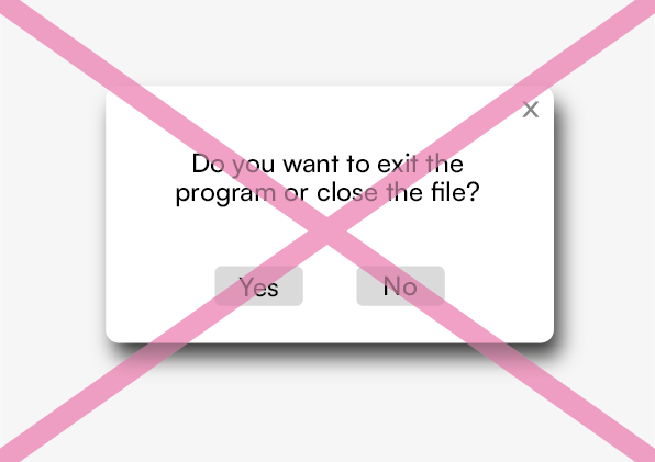
You’re probably asking yourself:”But what if I want the third option and Cancel?”. Don’t add a third button called ‘Cancel’, instead allow the user to click the X button located at the top-right corner, it’s universally acknowledged how that function works, meaning: close the message box and continue working, but most likely you haven’t saved your work and unless you have an auto-save feature, then press CTRL+S if you’re running Windows or COMMAND+S if you’re on a Mac.
In the end, easy-peasy wins the race reducing the onboarding process and avoiding the cognitive overload onto the user. Tasks shouldn’t be developed with excessive thinking, especially when we deal with a complex software that requires major resources and long hours from the user side.
Happy prototyping!